This component was created to solve a view manipulation problem once the base system had been resolved and established. The system dramatically reduced time to design, test and build it.
Problem
When I joined Virgin Pulse in 2018 they already had a solid team and a robust business. However as with many organizations, time had caused their design efforts to sprawl and become uncoordinated. The design team members were good at what they did but were not working together super well, and were not used to working with the developers at the level of coordination required to make the apparent quality of the apps come through. My background of team leadership and deep involvement with developers made me well suited to working on this problem.
Discovery
Virgin Pulse had 3 apps: a web application, a native iOS app, and a native Android app. The engineering org had chosen to let each native app be built in its default language and environment rather than using any sort of shared component library or framework to generate them. Different developers worked on each app and were allowed to bring their expertise in their platform of choice to their work. I felt this was a solid decision and a great foundation for a high-quality future, but in the present it wasn’t working. My job was to find out why.
One thing that was immediately apparent was that the designers were not working with a shared component library. They were copying elements from each others files and modifying to purpose. Ostensibly that was “coordination” but in practice deviations leaked in frequently. Another problem was that the team was mostly designing for web and iOS. Android was more or less an afterthought, created to match the iOS designs as closely as possible.
The designers and developers also lacked a common understanding and language to rally around. Design would declare things certain ways in their files but not really explain their thinking. Developers would implement based on their interpretation of what they saw, without coordinating with the designers or each other. Mistakes and inconsistencies were rampant. What passed for design components often bore no resemblance to their real-world implementations.
Reframing the Problem
I felt it was important to explain the problem along 3 principles:
- Tooling
- Communication
- Shared Responsibility
Tooling
For the designers to create consistent work they would have to be using consistent tools. The same applications, the same standards, the same libraries.
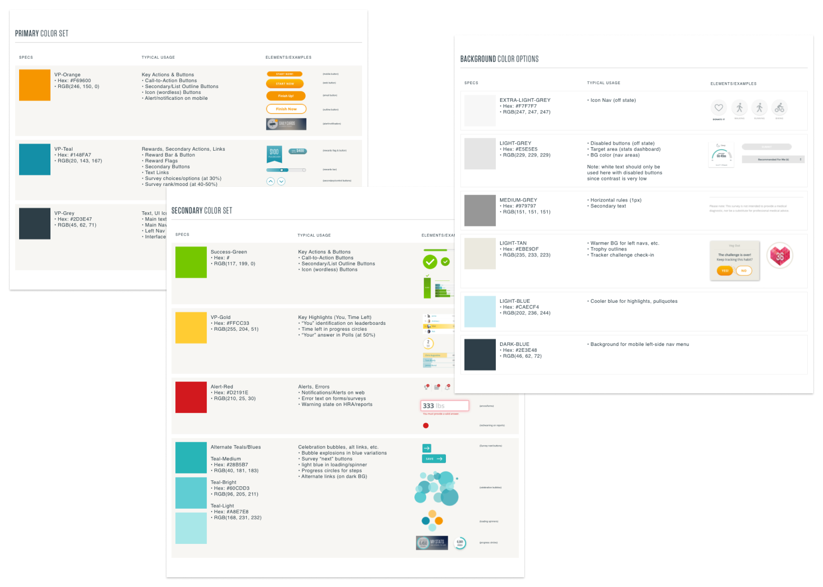
The original color system, resolved into sensible relationships and styles.
Communication
No design could possibly make it to production correctly if the designer and developer were not talking. The first time the designer saw the work should not be during sprint show and tell.
Shared Responsibility
Above all else, there was to be no attempt for any individual or group to blame another individual or group for the state of the application quality. This was not a problem created by the designers or the developers, it was shared by them. They would also have to share the solution.
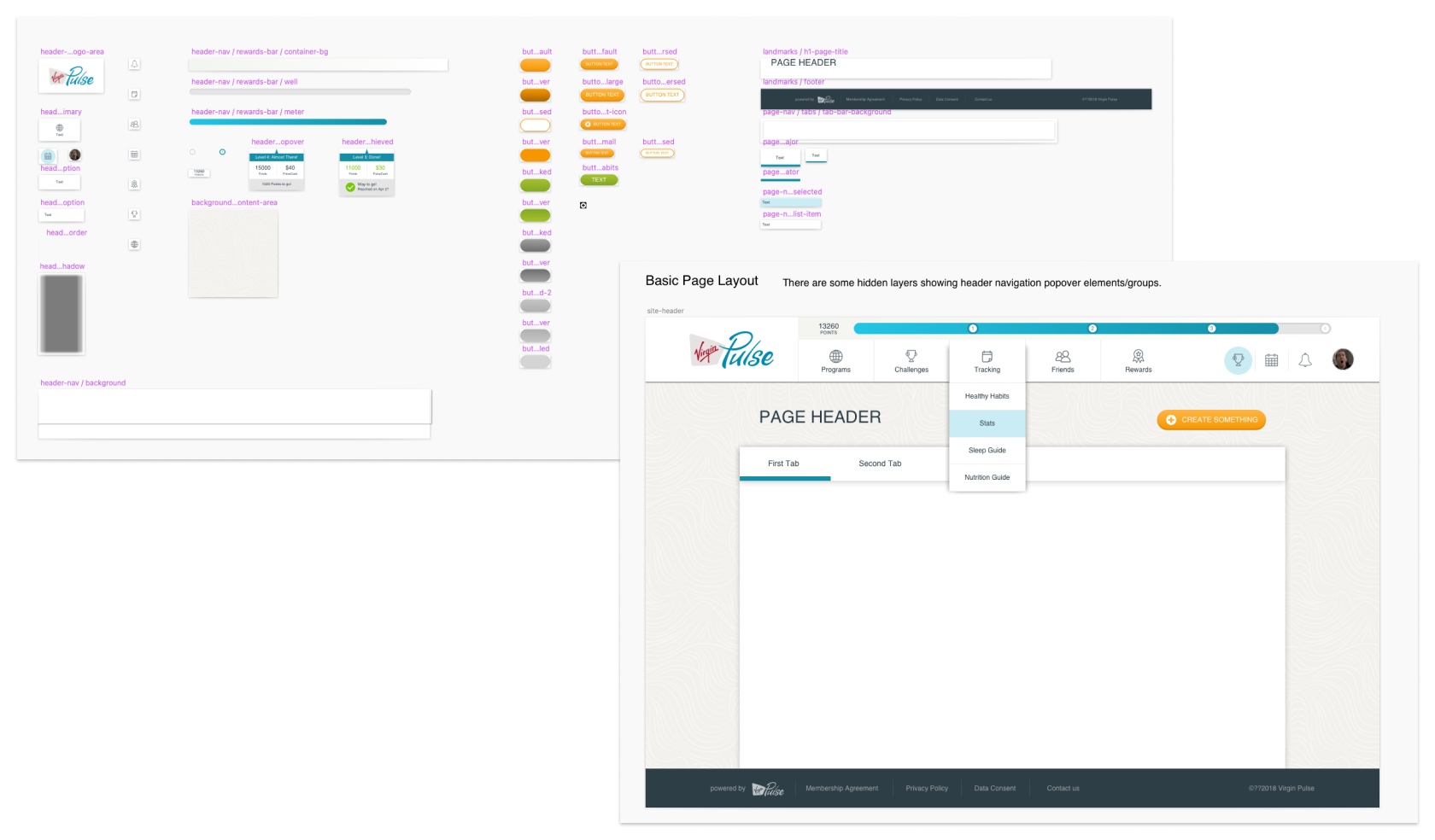
The consolidated web styles system and a basic page template built to standards.
Proposed Approach
I proposed a simple and consistent framework. We would build and adopt a shared component library across the design team. Each app would have its own library. Design tokens and other resources shared between platforms would live in a high-level library consumed by the platform libraries. Each platform library would eliminate similar but inconsistent component implementations. They would choose a version of a component and stick with it. That version would be suited to the standards of the platform being worked on to aid in user familiarity.
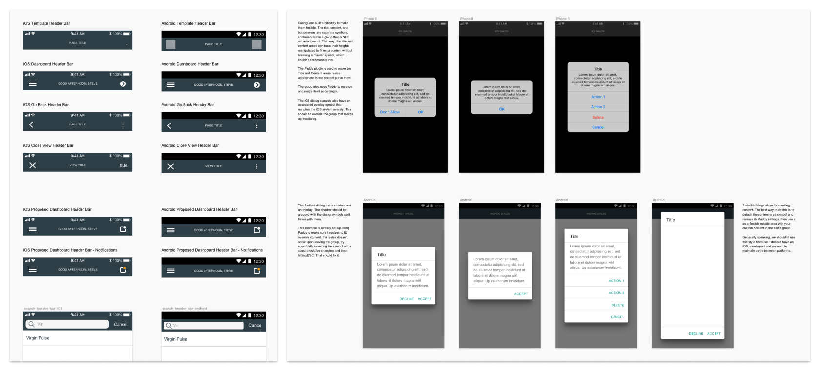
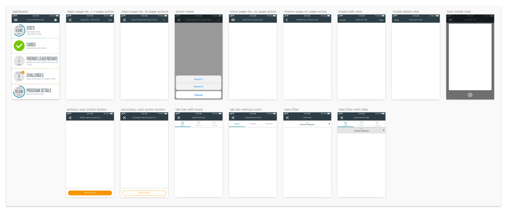
An example of resolved cross platform components for Android and iOS.
Another example of resolved cross platform components for Android and iOS.
More importantly, the chosen components would be real components: they would be exactly like what was used in production. Whether what was in production looked its best or not. There would be no more idealized designs, pictures of what we wanted that didn’t reflect our actual app. Every design would start by looking like it would look in production, warts and all. This stopped the designers from ignoring certain problems in the design of components. And it created priority in design reviews to fix the components in reality instead of in Sketch. If the design was ugly it was because the app was ugly, and we would fix the app. The app was the real product, everything else was just a picture to help build it.
I also brought the leads from each engineering team into the process, to help build a shared language and commitments to working together. From simple things like naming our color styles exactly like color values, to messy cultural things like insisting that no build would ever be presented until the designer and developer had reviewed it together. A few senior designers would be charged with oversight in different areas and work together to catch inconsistencies in design reviews, then work with the designer and developer to implement fixes properly. We would talk to each other to prevent bad work and prevent rework.
Implementing a Solution
Making these plans real was a very long road. I started this work within weeks of my first day (auditing the app and building the libraries), and it continued until I left two years later (the creation of a front-end team to build and maintain component libraries matched to the design libraries and optimized for a standard platform experience).
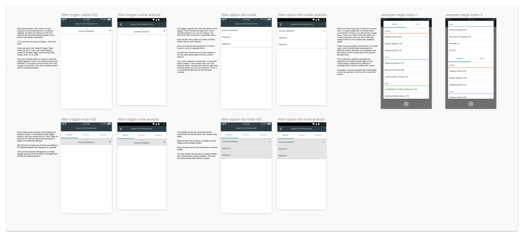
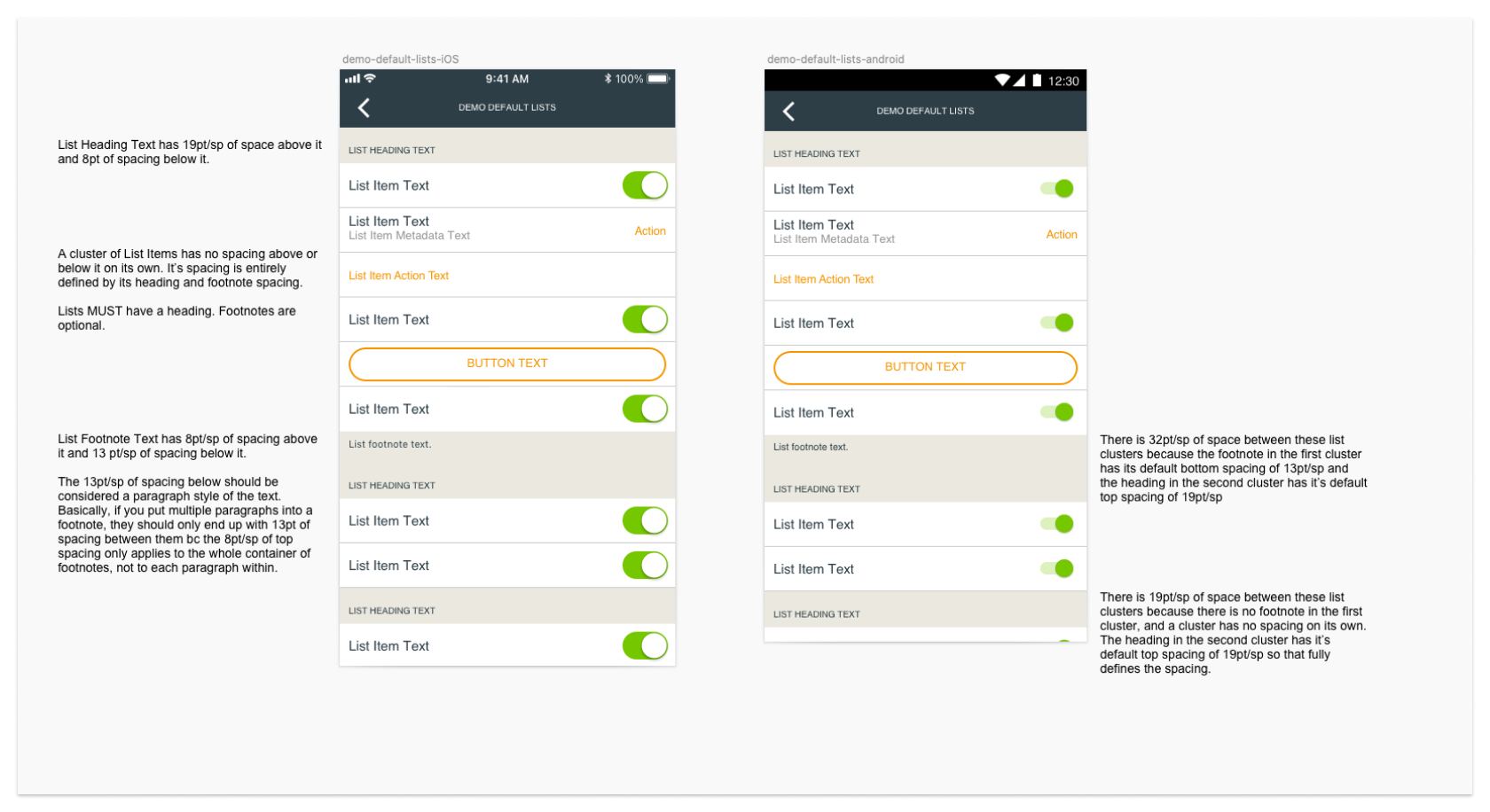
A set of screens built to demonstrate consistent usage of proper platform interaction patterns for common design flow problems.
I started with tooling. Consistent use of the same libraries and apps with contribution models worked out for new and updated components. Everyone would use Sketch, everyone would use the libraries, nobody would go rogue, designers would propose and build components together. If two people were doing the same thing different ways, they had to figure out how to do it the same way and enable everyone else. This probably took 2-3 months to get going robustly.
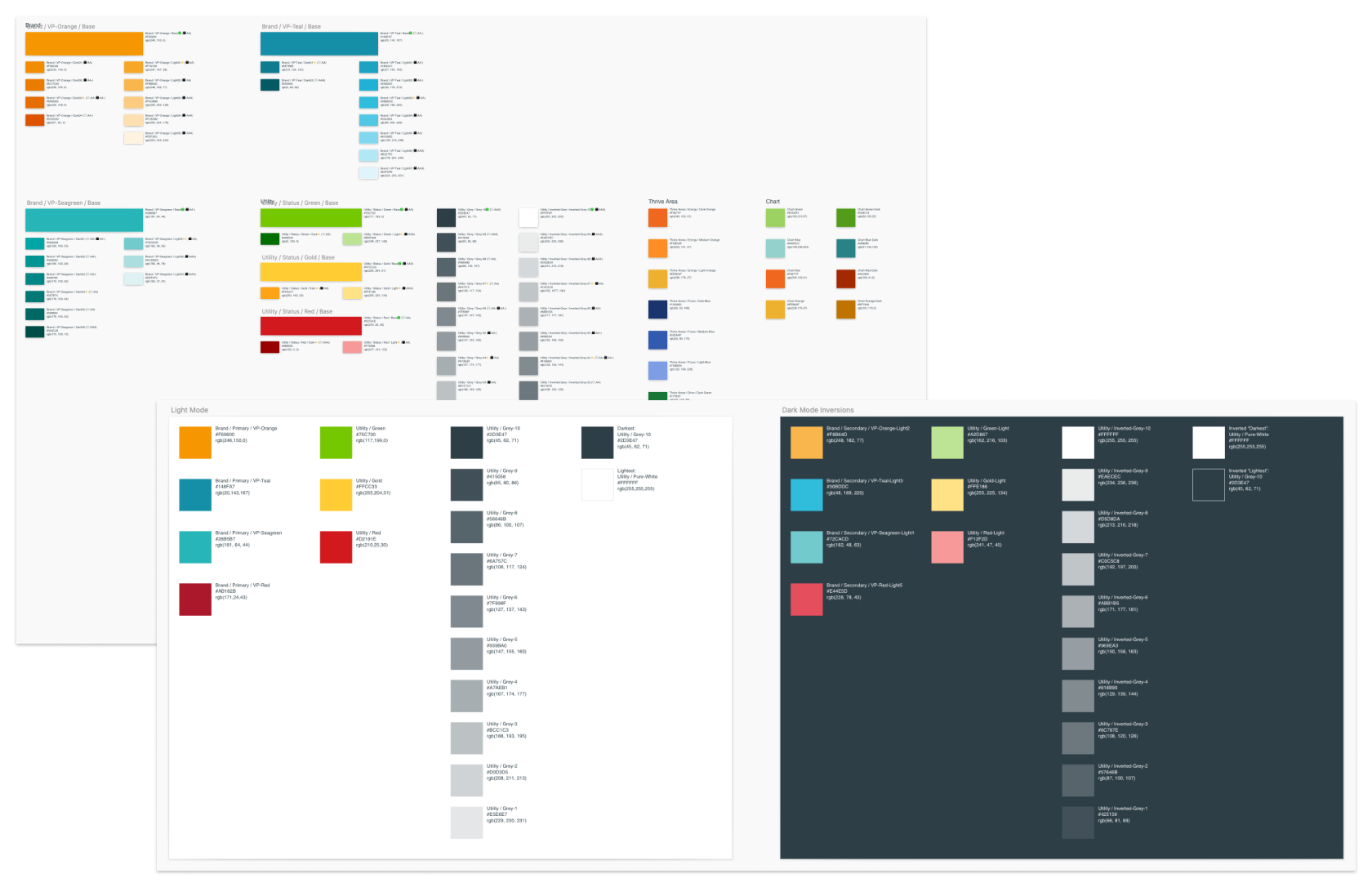
The new color system declarations, styles and guidance for use in standard and dark modes.
I also embarked on the hair-raising process of procuring software in an enterprise environment. I wanted a single source of truth for any work being done, and eventually settled on Abstract to do this for us. We got version control, unique URLs for anything we needed to reference, commenting and inspection, and we eliminated the sprawl and loss of file references. Abstract was definitely a love it or hate it requirement on the design team (surprise, Git is unintuitive!) but the developers loved it, the PMs loved it, and the consistent references had an easily observable positive impact on work consistency and quality.
Around this time I gave the work a “brand”, the Design Quality Initiative, complete with a logo and hub wiki page. I had observed that things tended to get done more enthusiastically when they were “official” so I just took it upon myself to give the work the trappings of officialness. It worked. Nobody really questioned it, it just seemed like something they were expected to commit to and they did. Would it have worked without this subterfuge? I’ll never know. But it sure seems like it helped make this real.
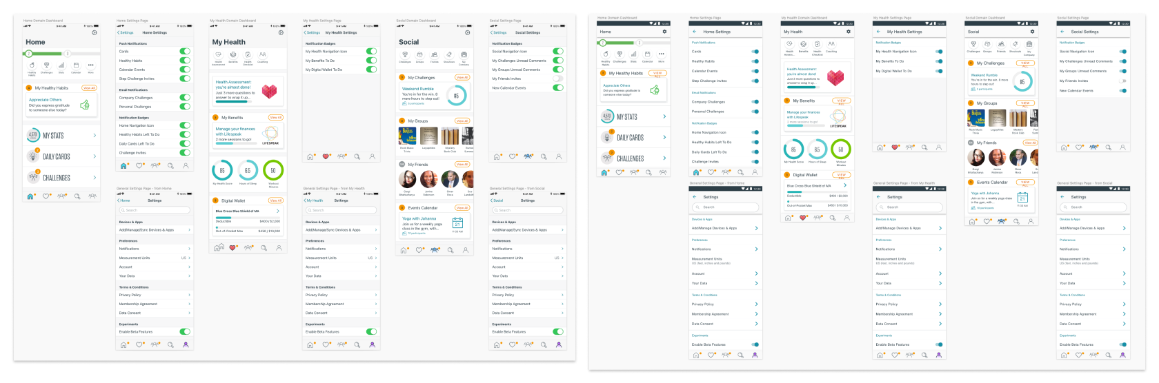
The final step of this years-long process was the funding and creation of a central team for building and maintaining a new set of libraries, around a brand new app experience. The experience itself would be redesigned from the ground up, in concert with the development of a new system to support it. The new system would finally create visual brand alignment across web and both native platforms, while moving further towards taking advantage of platform standards to create a familiar experience for users of iOS and Android. Each app would be unified by its information hierarchy, functions and design tokens, but allowed to have a navigation and text/icon setup that respected how things were prescribed by Google and Apple as platform owners.
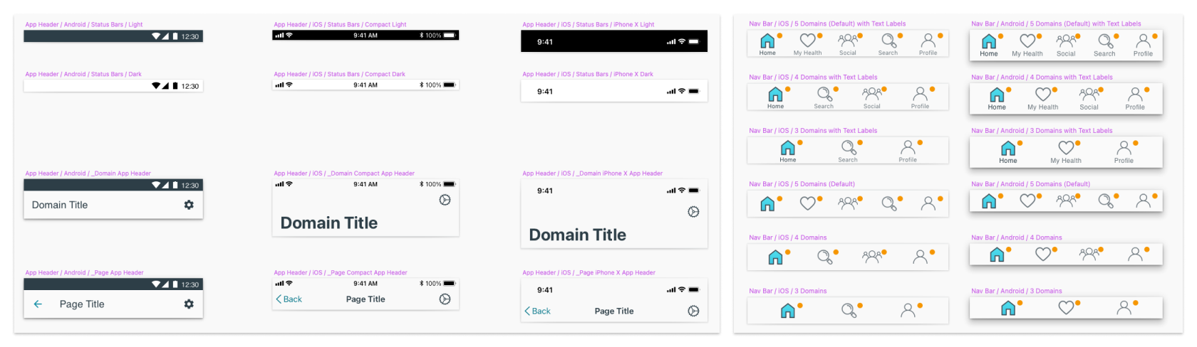
Cross platform component examples from the new, centrally supported version of the design system.
Our team was given room to build the basic app navigation and experiment with framing in existing functions, then slowing rolling out updates as the app become more and more consistent. We build further contribution models and documentation for other designers and developers to follow. This team represented to us a final acknowledgment of the validity of our effort: commited funding.
A set of screens and interactions built from the foundation of the new system.
Impact
Unfortunately the organization wasn’t set up well to create a quantitative measure of our success, but qualitative measures abounded. First and foremost, we nearly completely eliminated those hairy moments in sprint show and tell where someone asks “why is such and such like that?”. Within a few months we managed to remove stray color variables from the apps, structure and name a consistent method of applying colors correctly, and eliminate duplicate instances of common elements like buttons.
Within a year we nearly eliminated moments where a developer, unsure of the existence or usage of patterns in a design, would go rogue and build them from scratch, incorrectly. Developers became comfortable asking about usage of elements. Communication with designers became the norm instead of the exception, and especially with a group of new junior designers it became common for designers and developers to hold frequent 1-on-1 check-ins during design and implementation.
Above all else, the creation and funding of our new central design systems group represented ultimate success to me. Product leadership had seen enough growth in quality and elimination of rework to believe in the idea and fund it.
Lessons Learned
Rather than making a long post longer by repeating myself, please take a look at this post I wrote. It summarizes learnings from this project and from others since.