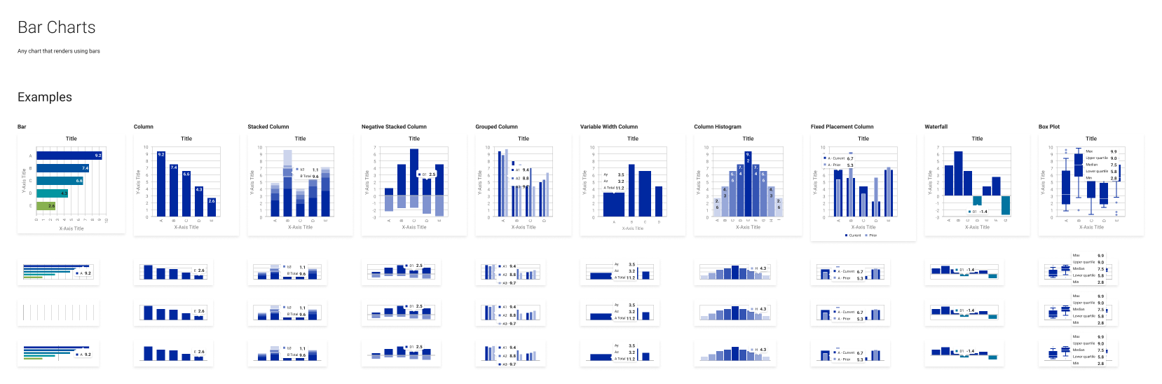
A selection of chart variants from a system I composed for financial data visualizations.
Over the last few years much of my work has involved building products and features within existing platforms. These platforms have had their own pre-existing conventions, patterns and visual languages. As a contributor rather than an initial creator I’ve had to become used to a new way of approaching my work. Here are some thoughts on what I’ve learned from this work.
Design Systems Are Not Figma/Sketch Libraries
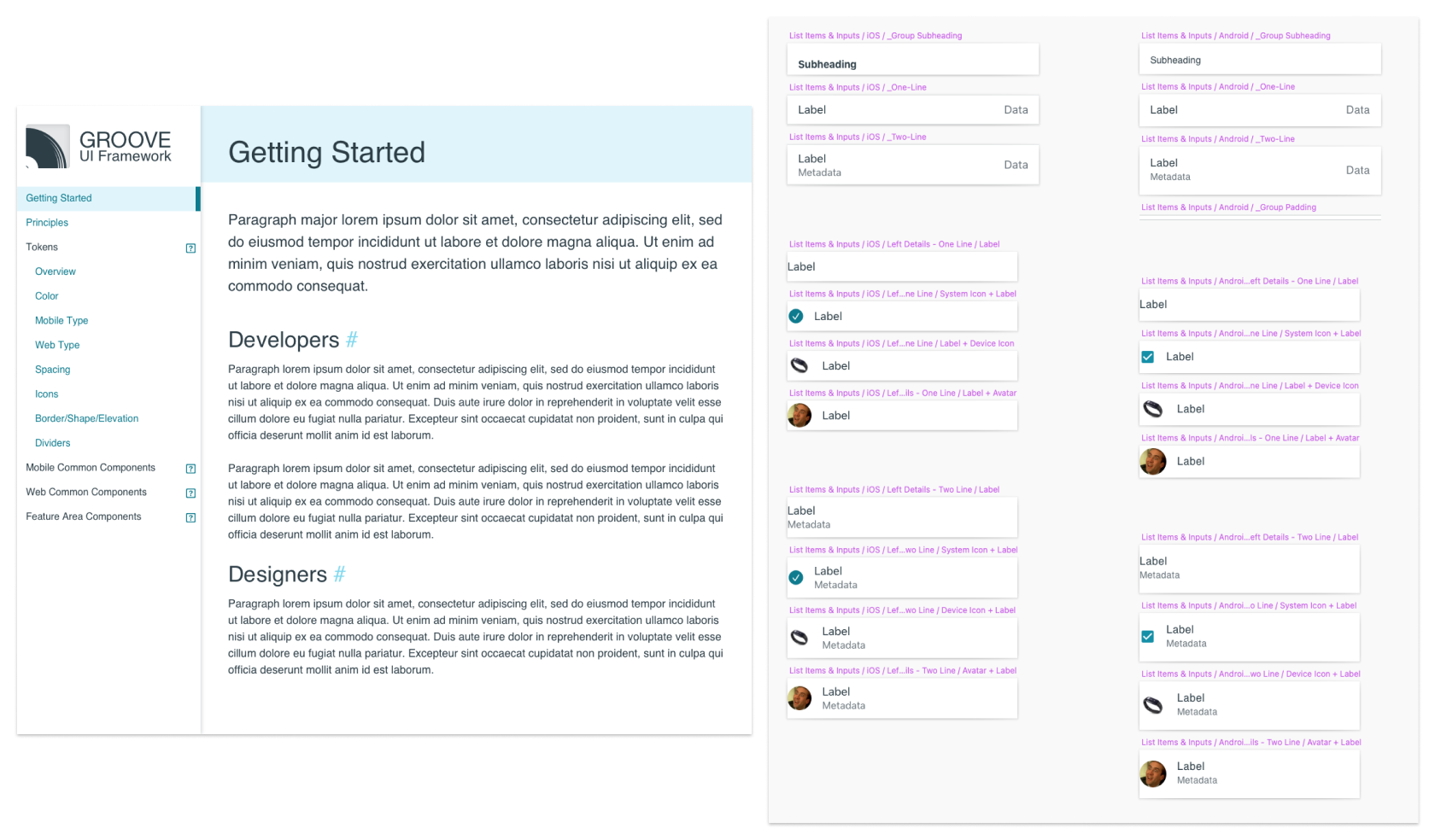
The template for a systems documentation site and an example of the components it supported. These were developed simultaneously to the dev components themselves, using the same naming conventions and parameters.
So many people think that the system is the thing they touch in their design tool every day. In reality, the system is what’s finally expressed as an interactable UI, being used by a user. Everything up to that point is just guidance, a contributor to the whole. The design component library is nothing but a piece of that story, the piece the designers will use to express their understanding of how something should function.
I find that designers are more effective builders and users of design component libraries once they understand this idea. This mindset prepares designers to do things like respect the reality of the final UI (more on that later), to express options and configurations in the same manner and language as the developers composing the UI, and to discuss the usage of the system as an evolving abstract layer in the product definition rather than as a sacred text with inviolable and unchanging laws.
Favoring Reality Over Aspiration Improves a System
I have come into teams before that claim to have a design system, but the work being produced in mockups has little relationship with the work being shipped by developers. Usually I’m told some variation of “well the developed components didn’t match our designs but it’s important for the mockups to look good...” Usually the person explaining trails off here because they have a hard time explaining why “looking good” is a useful goal in isolation (it’s not!).
Looking good is part of the constellation of goals that may contribute to good product. Advocating that the design component library mimic shipped code, warts and all, is often met with a look of horror because of this. But I think it’s important for the mockups to match the reality of what’s shipping. For one, when the design and dev components look the same there’s less miscommunication about intent in the visual design, which means less variation mistakes creep in over time. For another, if the mockups have warts and it’s explained that the final shipped product is the source of those warts, I’ve found it creates much more incentive to get the final expression of the UI in order, since important stakeholders are exposed to flaws before they ship and become debt instead of scope.
Communication is a Design System’s Most Important Use
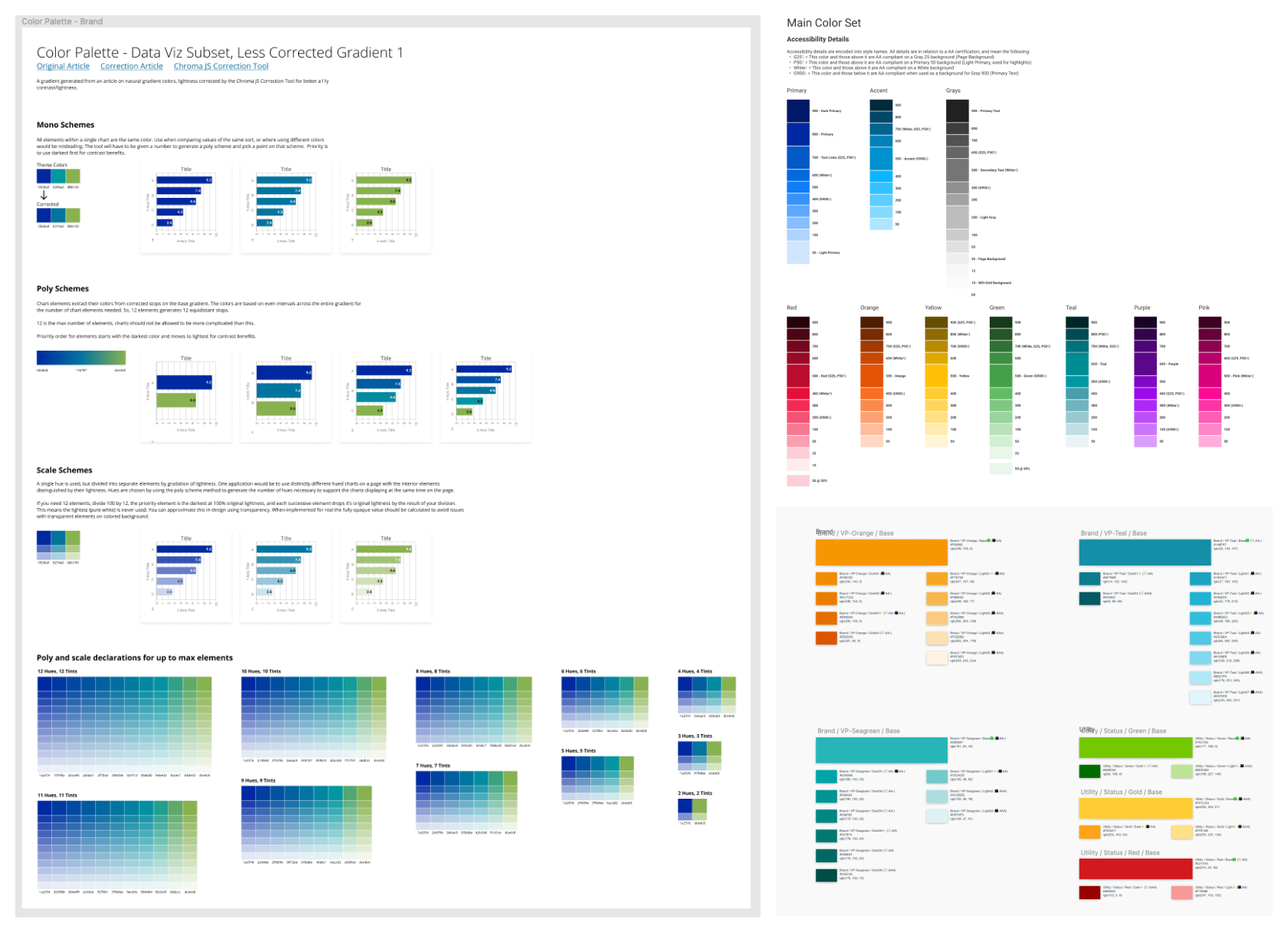
Various color definition systems I’ve created for design system library usage. All were refinements of real-world implementations of color in the existing platforms, and aligned with the same language developers used to declare them.
I believe that one of the most powerful things about a design system and the library that composes it for the designers is how the manner in which it’s built can facilitate or block effective communication.
Modern design software makes it easy to spit out components, but does nothing to make those components usable or useful on their own. If a designer understands that the system has the power to define the language used to describe the UI and the product, they can build in a way that improves communication across the team. They can do things like name styles and components the same way they’re invoked in development so that the developers and designers have a better shared understanding of the UI being composed. They can use and teach consistent language to stakeholders in product so that PMs and others can contribute to a design process that’s led by the designer rather than being the sole domain of the designer.
Design Systems Are Products
A design system and its component library are tools with users, complicated interaction patterns and constantly evolving layers of understanding. They’re products being used by product people to build more product. If we bring our knowledge of building good product to bear on maintaining and evolving them we can make them more effective for the design teams using them and the stakeholders relying on them to create clarity.
Principles, contribution models, documentation, release schedules: these are all ideas that make systems more usable, and thereby enable better work to be produced with them. When the team treats the system as a product they end up creating something vastly more effective than a mere collection of components.
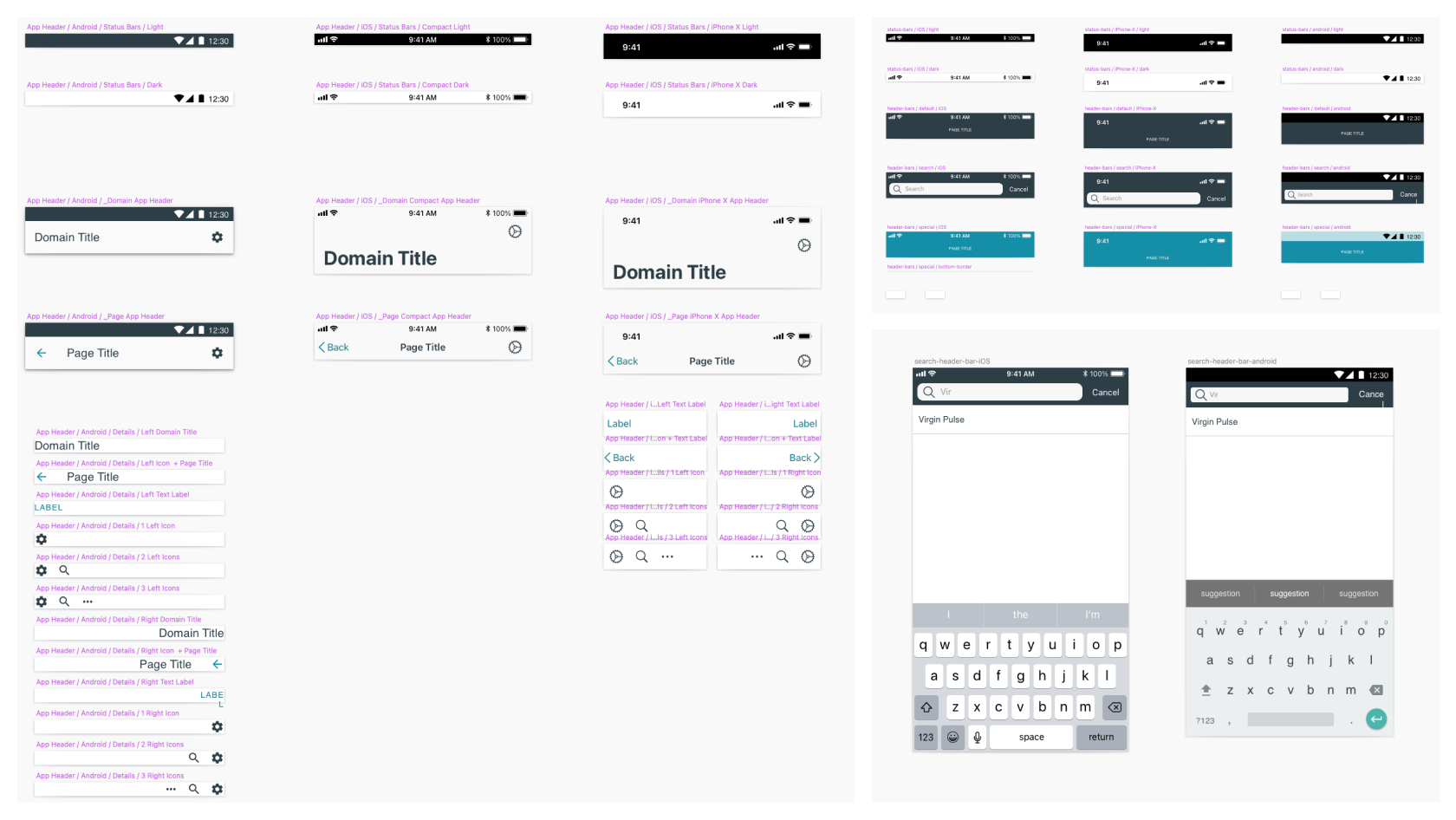
A collection of complementary components I designed and guided development of, based on the principle of letting platform conventions dictate how our approach varied between iOS and Android.