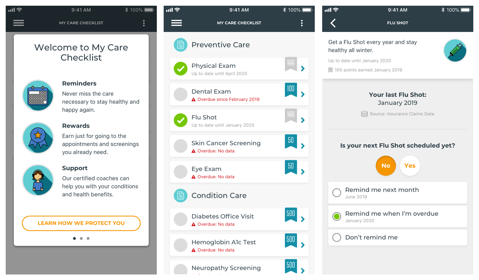
Problem
When I worked at Virgin Pulse the pitch was that we were a workplace wellbeing platform that incentivized employees to engage in healthy habits to improve their health outcomes and lower healthcare spend. Over the course of my time there we aspired to be thought of more by client HR departments as essential inputs to the healthcare component of that pitch rather than a simple wellness benefit.
One of our first efforts was around a problem described as gaps in care. Simply put, people frequently miss the recommended preventive care that helps them stay far ahead of expensive health problems (annual physicals, flu shots, dental appointments, etc). They are covered by insurance, low cost, and immensely preventive.
Getting users to make these appointments into a habit could lower personal healthcare spend and that of self-insured employers. These are employers which take on the cost of the benefits, using the insurance company for admin. They have a direct incentive to limit costs, and gaps in care are considered to be pretty low-hanging fruit. Proving we could improve health and reduce spend would be the first step in shifting our value proposition.
Discovery
A major concern was whether or not the feature would be thought to be creepy. Users would be getting alerts about things they probably didn’t think we should be able to know about. At the time we were designing this feature there had been many prominent data breaches in the news and we worried the sensitivity of this information would be top of mind for users.
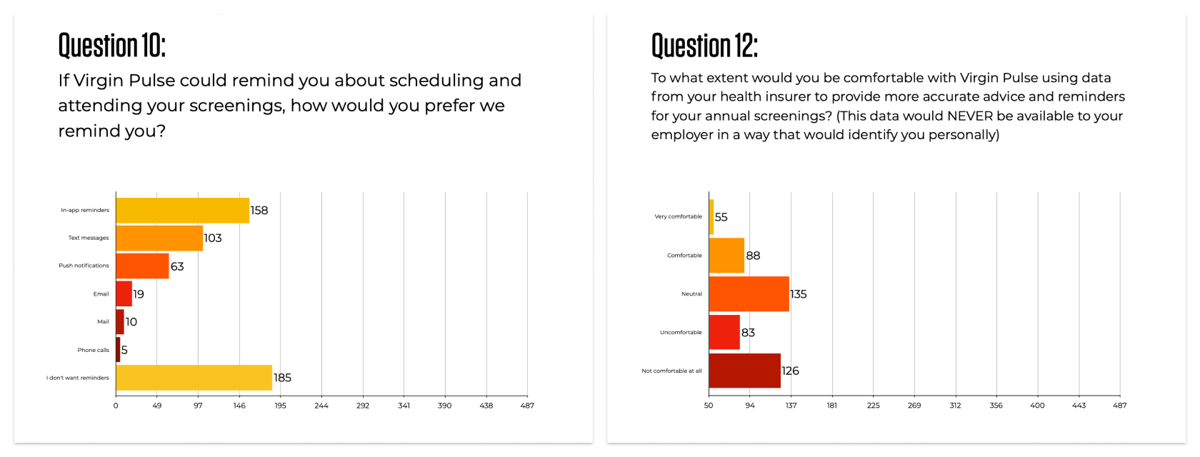
These are some question results showing how members felt about what we dubbed the “creepy problem” during our discovery research. You can see the full presentation here.
User interviews showed us that while users had a general concern about security and their data, most had a positive reaction to being placed in control of that data and consenting to how it would be used.
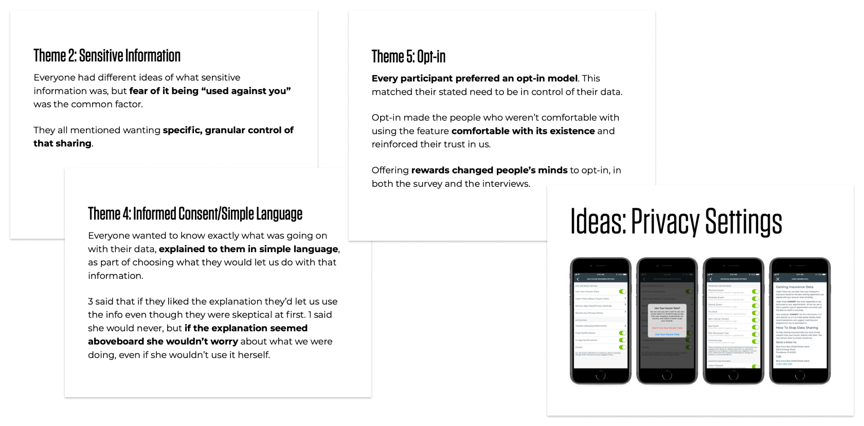
These are some themes and ideas developed from interviewing members. You can see the full presentation here.
Reframing the Problem
The business problem was pretty directly about saving money for customer organizations, but the feature was thought by the business strategists to be simple enough that we would certainly solve it. As the discovery and design lead for the work I wanted to make sure the product team remained focused on our users and their privacy. Users needs to see the benefit for them (better health and lower costs) and understand their privacy was safe (their employers could not see the health events in the feature and they would have recourse against us in the event of a problem).
Furthermore, to fit into our product cleanly the feature had to be organized around incentives and creating healthy habits. We hypothesized this would help it be more successful since the product had already found success using this framework.
Proposed Approach
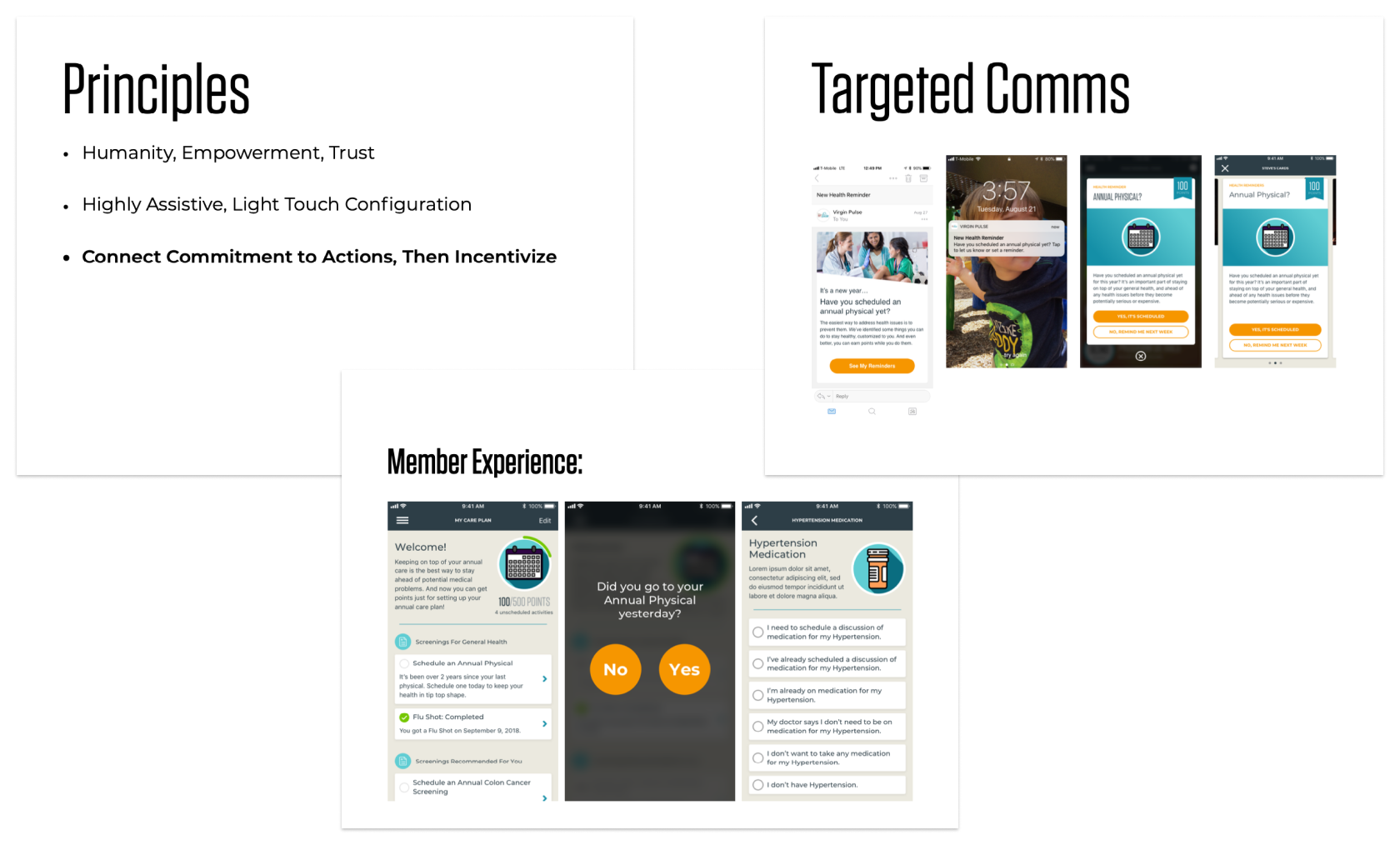
These are some slides from my presentation on the proposed design approach. You can see the full presentation here.
Through an acquisition we became able to read insurance events for self-insured companys that allowed it. This capability would power our solution by giving us info on when appointments and activities were timely, and letting us avoid triggering notifications for ones that had been completed.
I advocated for designing the feature with a focus on “privacy first”, something I also pushed to be considered across similar products as Virgin Pulse moved further towards healthcare. Users should never be uncertain about their privacy as the platform changed from a game to something more vital. Given Apple’s success with messaging in a similar fashion product leadership bought into the approach.
When activated, the feature would not surface any data or knowledge of events to a user the first time. Instead it would explain the feature, our security approach, and their options. Users would be asked to opt-in to the feature and allowed explore their concerns about their data further, rather than opting them in automatically. It was stated directly to users that their employers could not see or monitor this information, and they could keep the feature off if they were concerned.
Using insurance data we would identify if and when employees had engaged in regular annual preventive care and chronic condition care, create reminders for that care, surface the reminders at intervals appropriate to their insurance coverage, and reward them for following through using the existing program rewards structure. At every point of contact we would look for opportunities to remind users their data was safe and give them access to control over the use of the data.
I sold this solution by putting together a video of a pretend usability session (link will download video file) with a user running through the new feature for the first time. The script I used was drawn from imagined responses based on our user interview feedback and the first draft of the solution we were proposing. While this was obviously staged, it turned out to be a compelling solution to selling the vision to product leadership.
Design Solution
The initial solution focused based on two main parts of the experience: the feature introduction flow, and the screening and rewards flow.
The feature introduction focused on the health and financial benefits to the member, how seriously we took security and privacy, and introducing them to the controls they would have over their data.
Click here for the feature intro and security prototype.
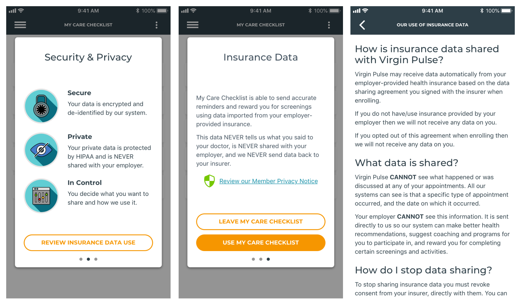
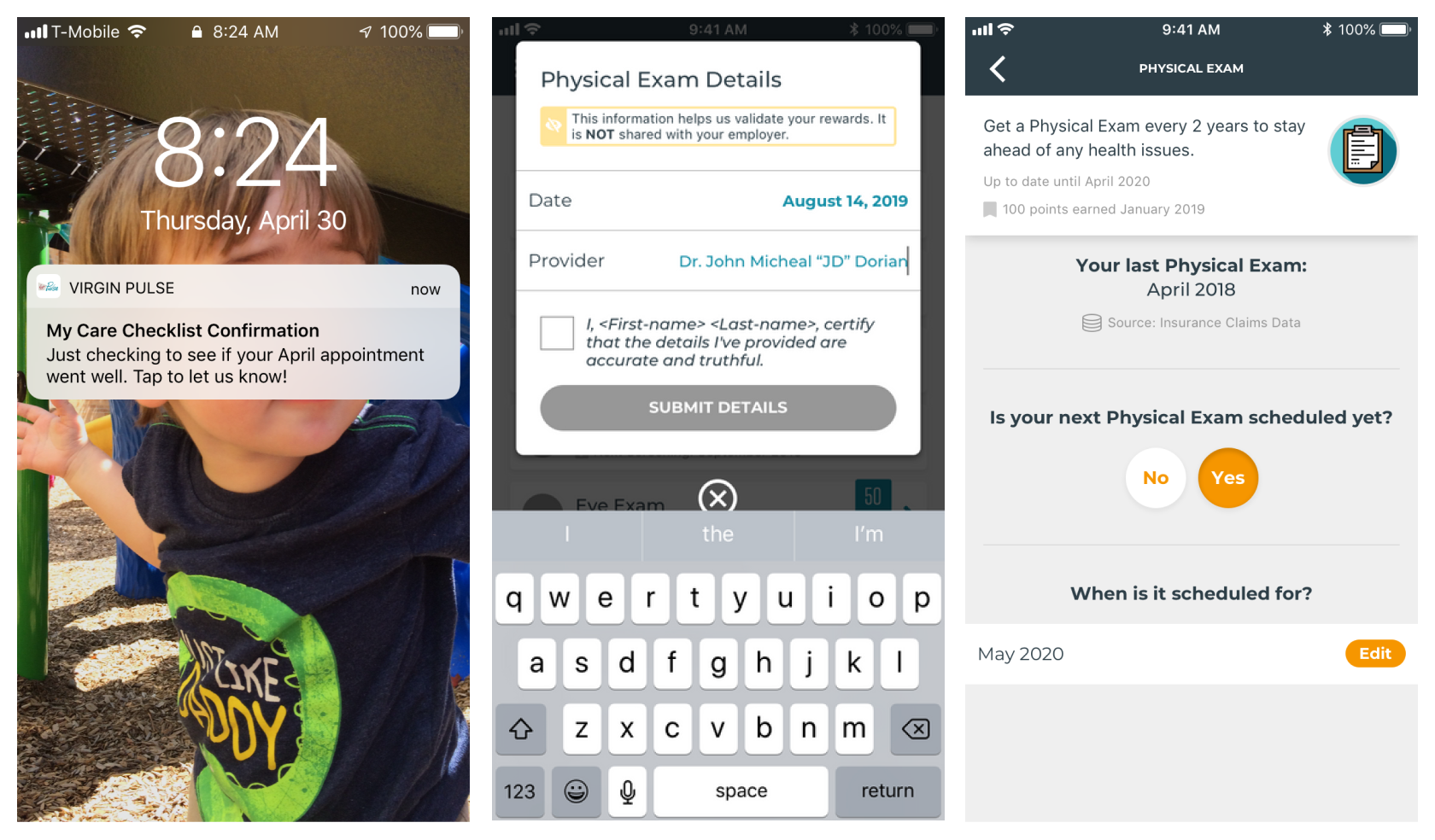
Screening and rewards focused on using insurance data to notify members of gaps at the right time and asking them to confirm their participation. Confirmation would produce points in the apps rewards game, and move the member towards fully checking off their health goals for the year.
Click here for the screening and rewards prototype.
Impact & Lessons Learned
This project afforded me the opportunity to lead research, concepting and execution through every step as the primary responsible person. The feature was assumed to be “easy” when I first started due to the data from the acquired company that would make it possible. I was largely left to my own devices to conceive it, and chose to do extensive user research, background research, and strategy definition rather than go along with the origial expectation that I would just “toss a few screens together”. I also worked closely with the company’s privacy lawyer to understand the legal ramifications of what we were proposing, and with security and privacy experts.
My research and presentations were key in revealing to the company that this was going to be a much bigger swing than ultimately estimated, and in moving resources to the problem. My strategy work and user research also shifted the product org towards considering the feature and the platform through a privacy-first lens, something I am particularly proud of.
Unfortunately, I left the company before the feature was launched. However in speaking with former coworkers and seeing how the company’s messaging and features have shifted since I left it’s apparent that my work laid a crucial foundation. Privacy and control messaging is visible throughout features with advanced data utilization and the idea of closing care gaps seems to be integrated across features rather than constrained within the original feature design.
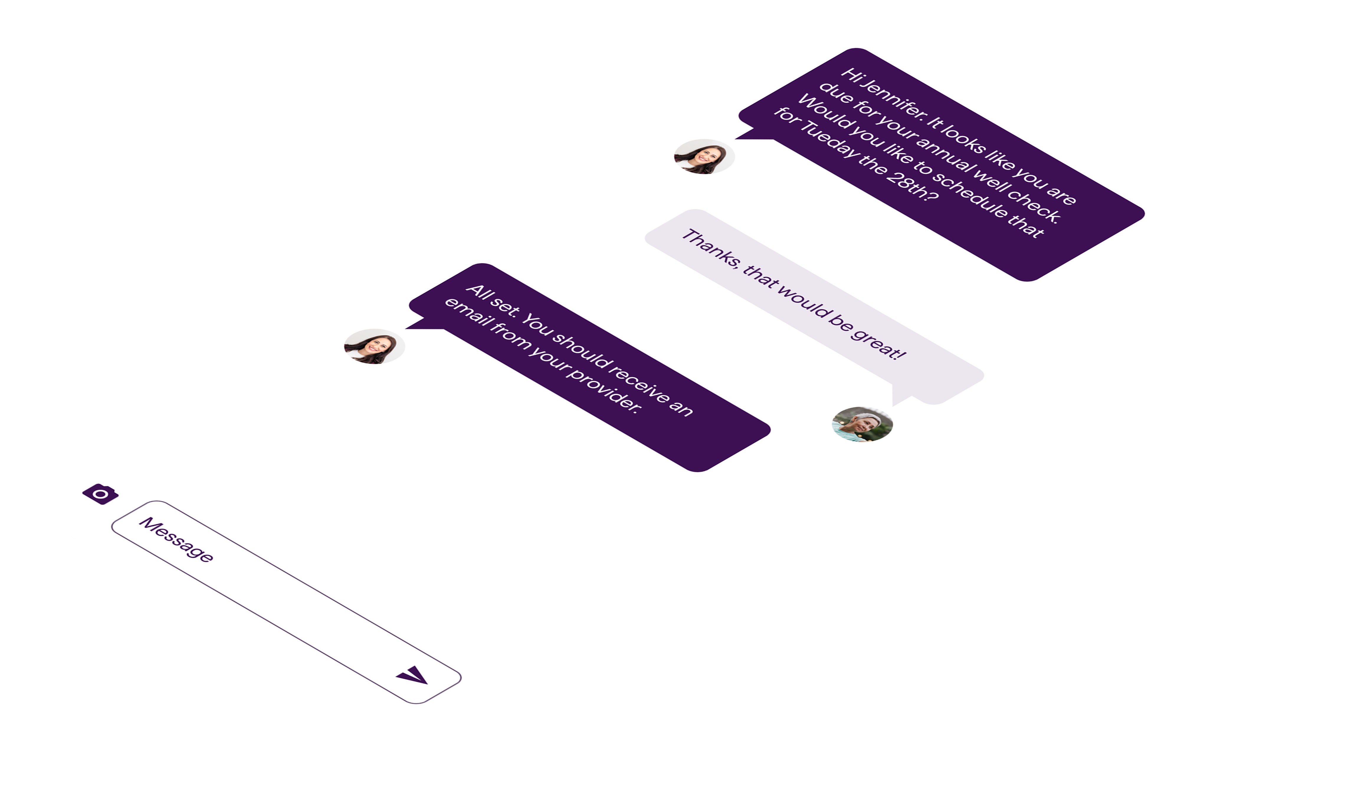
This is a screen from the current iteration of the app showing gaps in care prompts incorporated into direct coaching. This image is not my work, just a demonstration of the feature’s evolution and impact beyond my work.
As the first feature in Virgin Pulse’s migration towards healthcare engagement and navigation my work seems to have set a good tone for what has followed.