Problem
Fidelity engaged my team at Rocket Insights to work on a design sprint for a fairly simple initial project: create a clean, modern, persona-based starting page for their Wealthscape wealth management platform that would allow financial managers to more effectively and efficiently serve their clients.
Discovery
The project started with an intense design sprint. Across two weeks in January of 2020 the project team worked on site at Fidelity’s office in Boston’s Seaport, directly with product leadership and key product managers. The intention of the sprint was to understand the core needs of Wealthscape’s primary user personas, and where it was falling short in meeting their expectations.
We conducted a pretty standard set of sprint workshop activities, but were also able to start with extensive user interviews during the first week. The sprint then extended to a second week where we prototyped and tested our solutions with the original user interview group. This extended sprint schedule allowed us to really key in on user needs before ideating, and seemed to lead to a much better alignment of our design work with those needs.
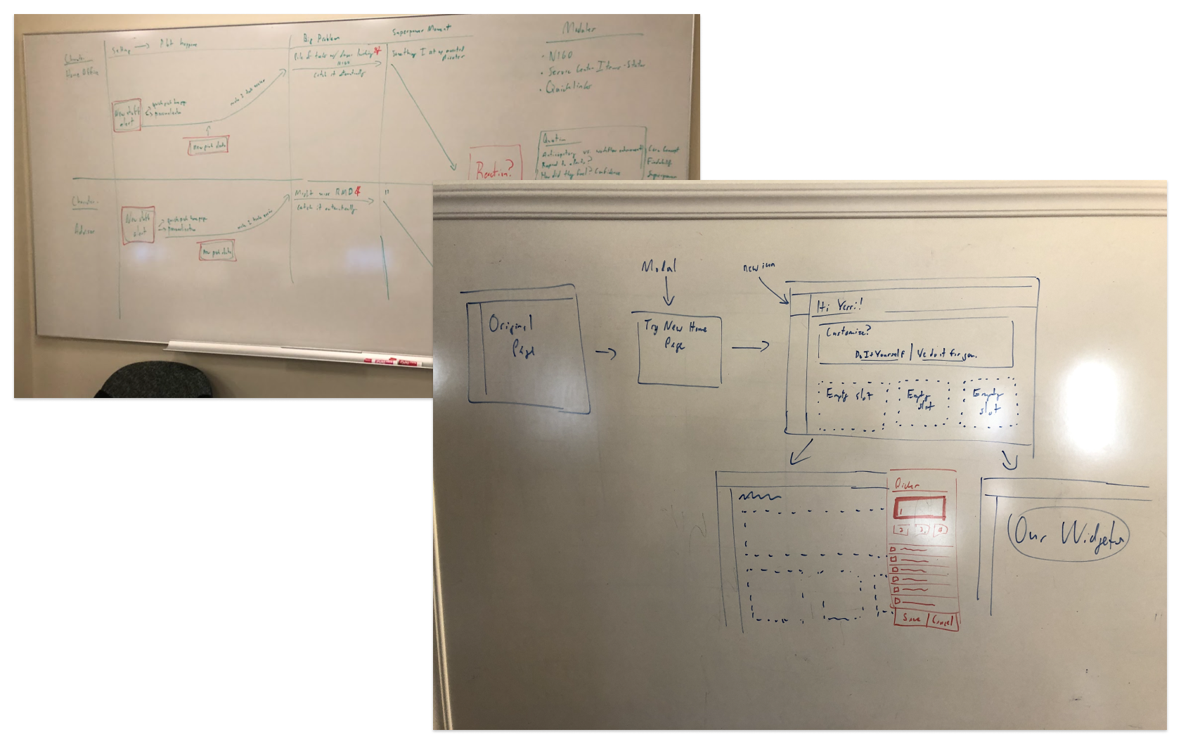
An early whiteboarding sessions yielded a story/flow that eventually became a rough interaction idea, later converted to prototype for testing.
Finally, a third week would allow us to refine what we learned from user testing during week two, to finish (we thought) the engagement with a robust prototype and recommendation set for Fidelity to pursue.
Reframing the Problem
Our first round of user interviews showed us that the existing start page for Wealthscape was thought of as essentially useless. Nobody every did anything from there except open the navigation and immediately click on something else. App analytics confirmed this as a general usage pattern among all users, not just the key personas we evaluated.
Previously, product management had considered it their “most used” page, but it became clear this was only because users landed on it automatically when logging in. When users revealed that they never actually used it the analytics were retasked to reveal their key destinations when leaving it.
We also discovered that most users had very different sets of tasks they engaged in. Even though we had defined key personas that did a decent job of describing sets of activities a user would likely engage in, every client organization and their internal teams tended to organize their work distribution in different ways. There was no way to assign a strict core set of functions to a user based on role-based access management because defined system roles didn’t align with real-world activities, and we could not realign those roles based on how they were shared across applications.
Proposed Approach
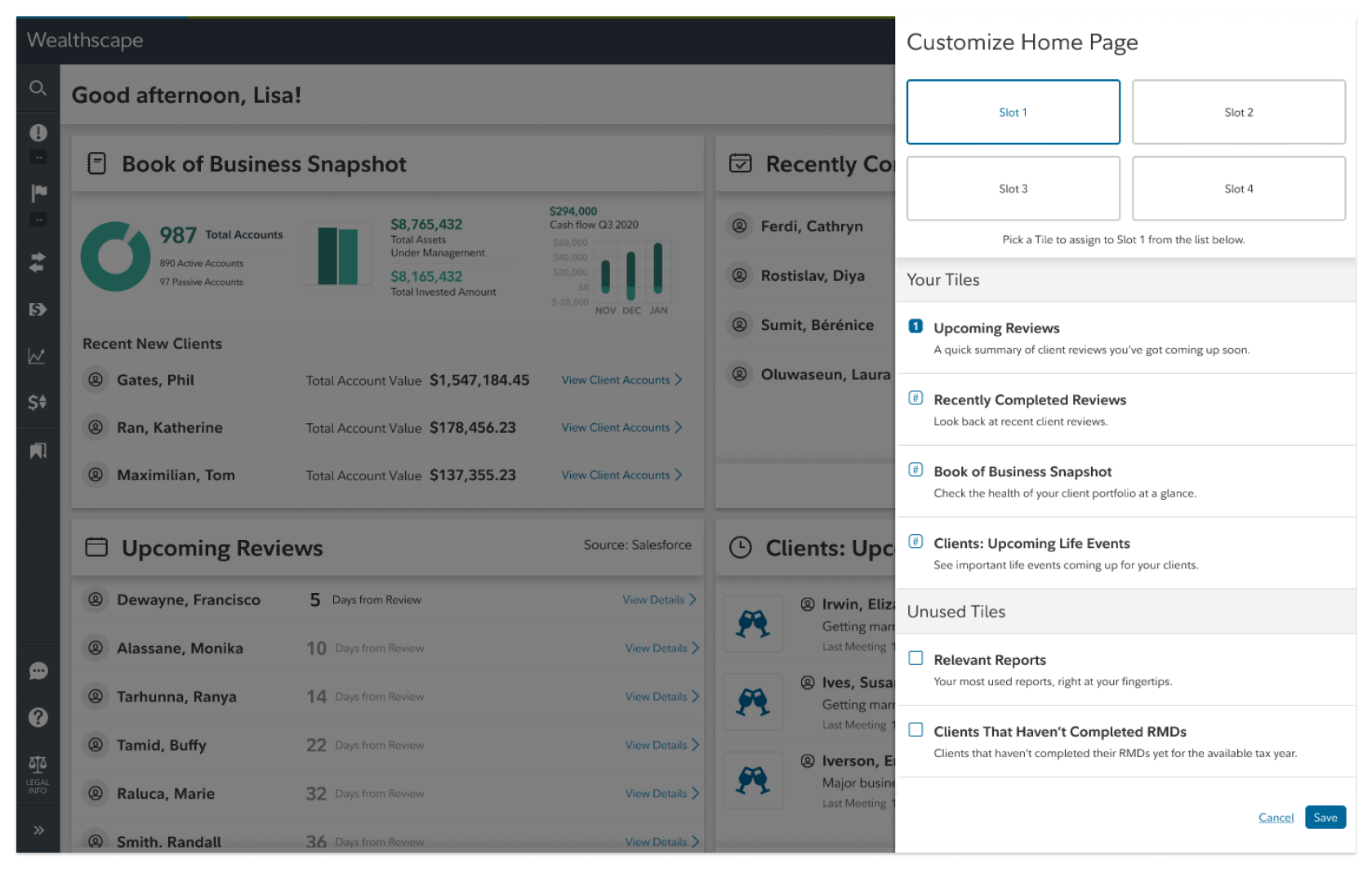
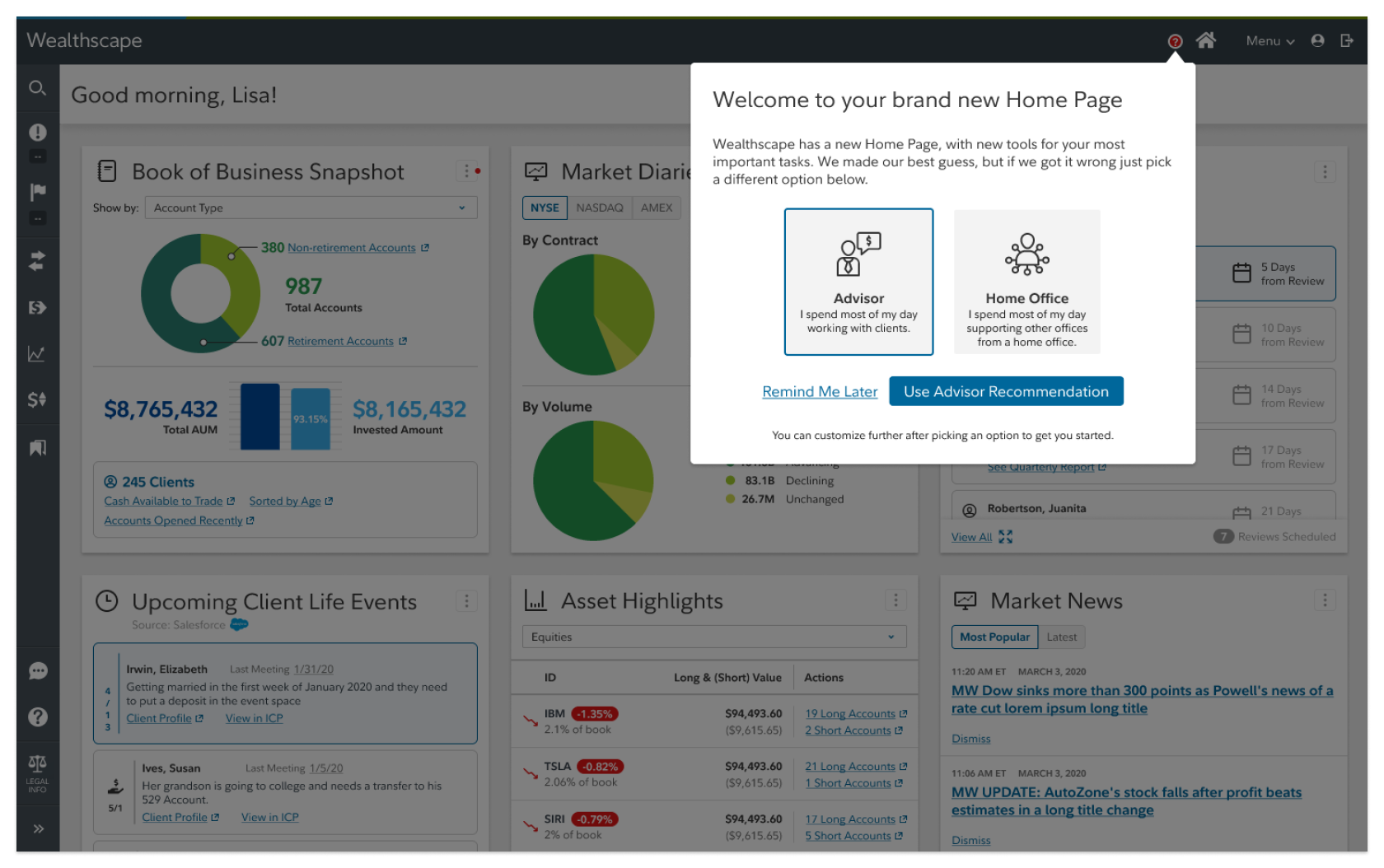
We ended up proposing to test a configurable starting page for users. The start page would look like a dashboard with functional tiles surfacing key data in common workflows for the user to launch activities. Because there were many commonly used functions and little consistency of usage, the page would be configurable. Users could select the set of tiles that best suited their common tasks and usage patterns. We would attempt to define a “starter set” for a user by asking what best described their role boundaries and they could modify from there, or just build a start page from scratch. Our testing sessions during the sprint’s second week would investigate the validity of this approach.
This was the first configuration prototype we created for testing whether the idea could work.
Click here to try out the first configuration prototype.
This was the next configuration prototype we created for testing different configuration methods once we felt the idea was sufficiently valid.
Click here to try out the second version of the configuration prototype.
Designing a Solution
Our initial prototype tested well. Users were generally positive about the idea of a personalized page, but they didn’t really want to do any work to get it. They also didn’t feel like exploring. Generally speaking, when they came to Wealthscape they already had a purpose or task in mind. It was a part of their total tasks and workflow, not a destination they wanted to spend additional time in.
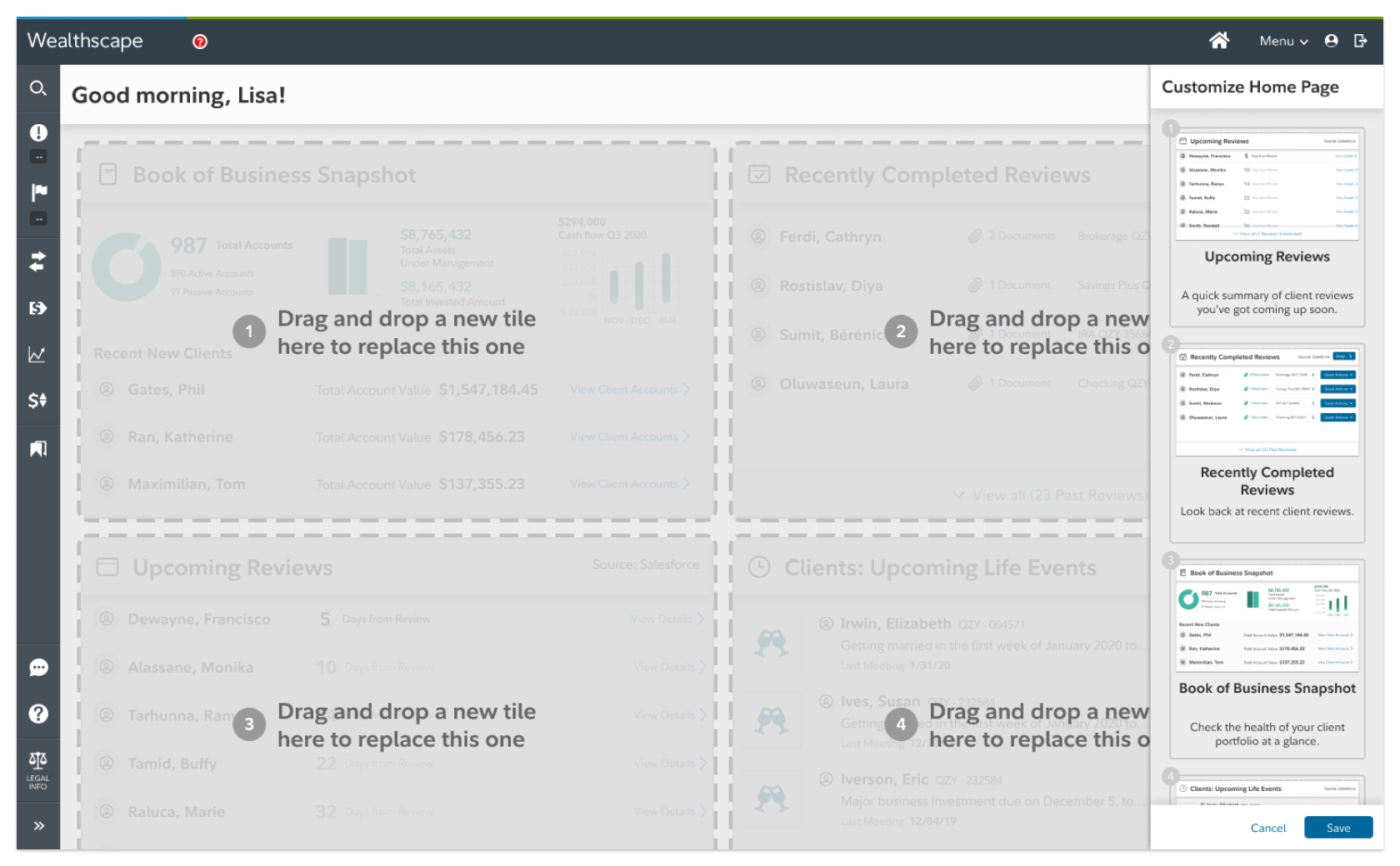
From this we hypothesized that the next version could more safely rely on giving them a page customized to the role description they felt best matched them. They wouldn’t have to do any initial work to get going, but could see the power of the newly available workflow entry points and that might eventually inspire them to explore further if it improved their workflow and efficiency overall.
This version tested better and validated that users were generally accepting of the recommendation set they were given, and looked favorably on the new functionality that was surfaced to them. They could see clearly how this would improve their ability to jump into key tasks quickly. Based on these results it was decided to pursue the proposed sprint outcome, and to keep us on longer in order to refine the work and then integrate with their dev teams to deliver it.
This was the final sprint testing prototype, to test the user’s reaction to a real tile set allowing selection based on persona-based role descriptions.
Click here to try out the final testing prototype.
Further refinement and a third round of testing was geared towards improving the tiles themselves, refining the interaction design of configuring the dashboard, and aligning the prototype’s visual design with Fidelity’s internal design system standards for the application. Rather than just being tasked with ideation we sould be implementing as core team members.
Impact
Ultimately we were engaged to continue our modernization effort across the entire Wealthscape platform, including the investor experience side of the application. Our directive was to implement and enhance their existing design system, Basis, as well as consider and propose changes to the core interactions and experience to bring the platform in line with current standards and expectations. A two-month project turned into 18 months for myself and my co-designer, and the work has continued further after we left the project, and led to additional major engagements with other teams at Fidelity in key strategic areas.
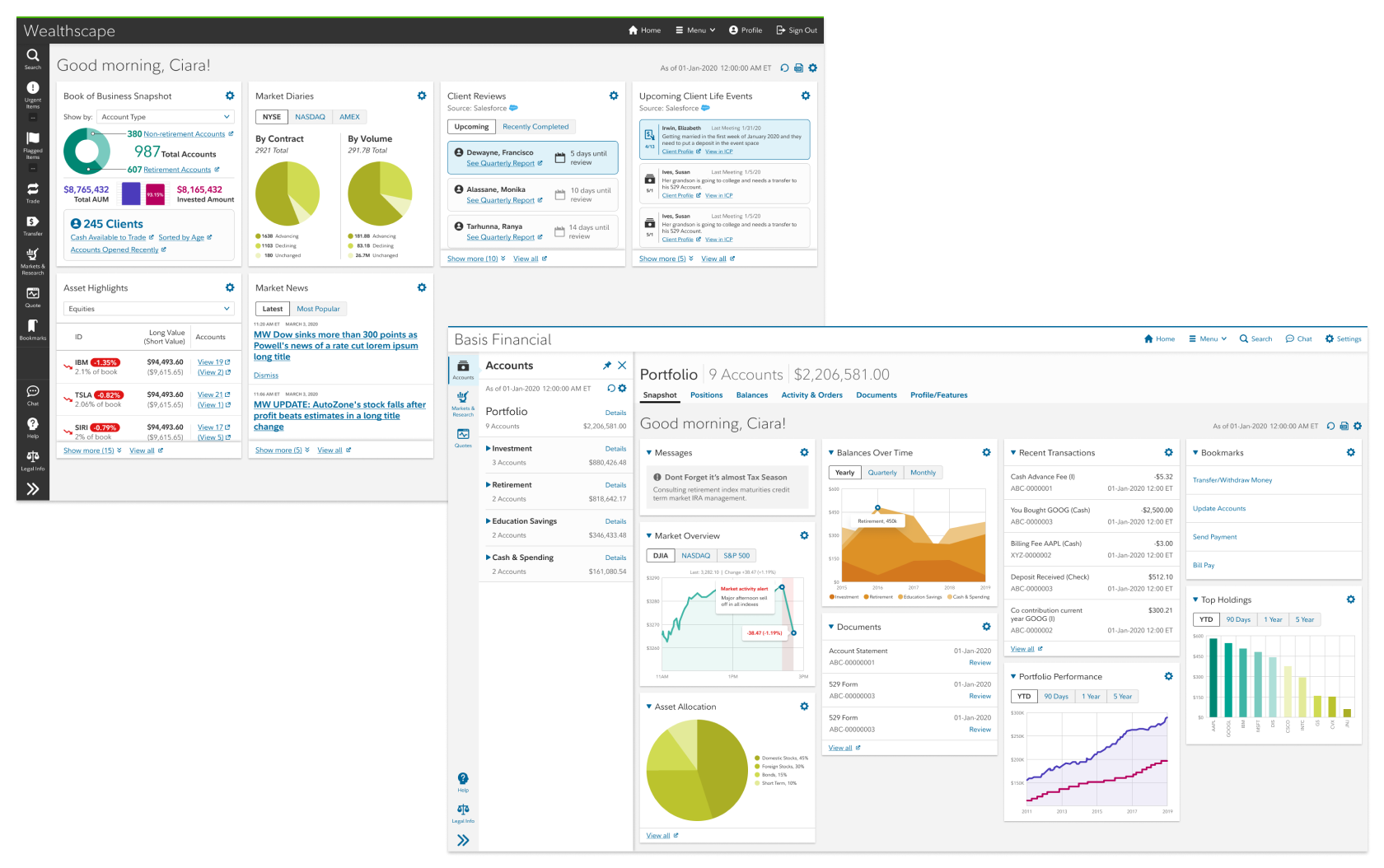
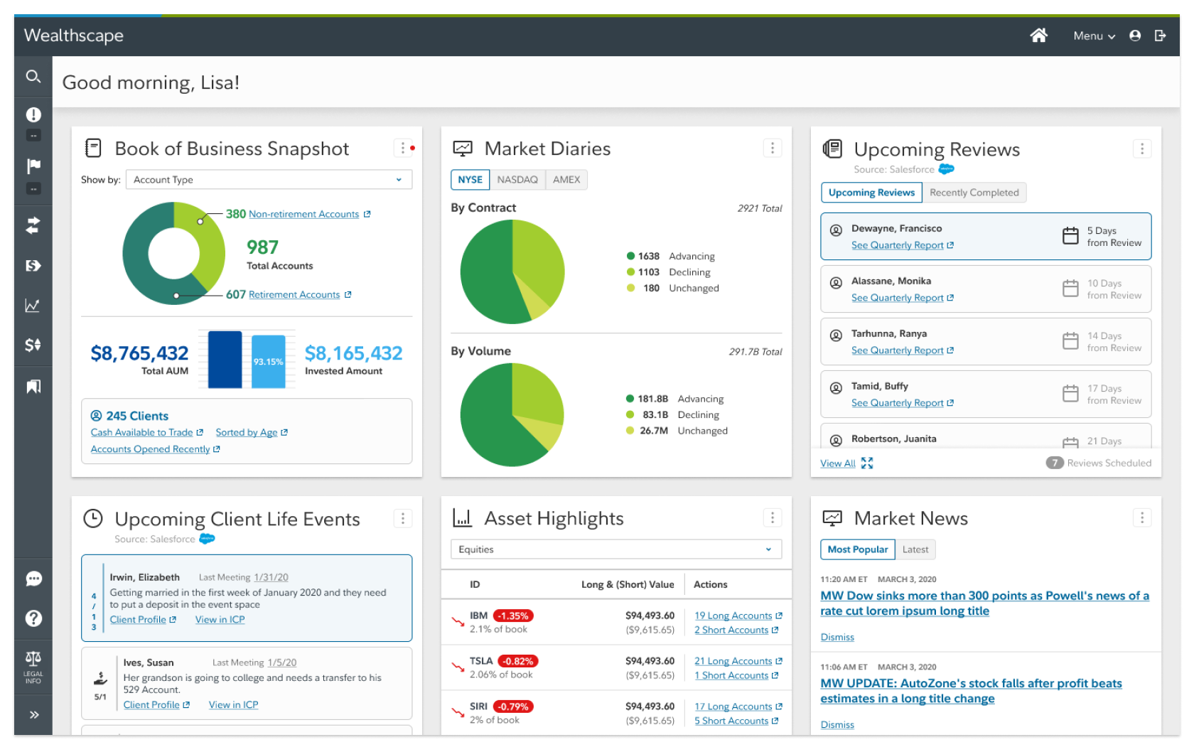
These designs are from further refinement rounds as we worked with developers to implement across multiple platforms.
Lessons Learned
While we were tasked with an initial short innovation project, which was a typical engagement for us, the power of that work led to implementation within a major enterprise. Fidelity is massively larger and more complicated than my previous experience, and this was brand new to the less experienced members of my team.
Adapting ourselves to the politics of a huge organization, as well as detailed regulatory requirements and complex relationships was a huge learning curve. It’s not a typical engagement for us, but in the 3 years since we started it’s becoming more common. And frankly, it was especially welcome in the early days of the pandemic to have a client that was well-established and reasonable about constraints. We all learned together to deal with a major disruption to our lives, and I fear that could have been much worse with a typical early startup client.
I think the final valuable lesson for me was in helping junior designers adapt to the type of environment I’ve described. Most come to an agency looking for variety, many relatively short projects, and work that’s primarily concepting and innovation. Getting into the implementation weeds can be unfamiliar and undesireable territory at that career stage. Over the last few years I’ve learned the value of modeling professional behavior for these employees, and helping them understand the ebb and flow of innovation and delivery. An insight that has seemed to resonate particularly strongly with them is the idea that this is job: it doesn’t end once the “fun” prototype is done, you have to bring it home. Real design work means going all the way to delivery and maintenance. That perspective has been a tidal shift with a few of the designers I’ve worked with since then, and watching them adapt and flourish has been rewarding.