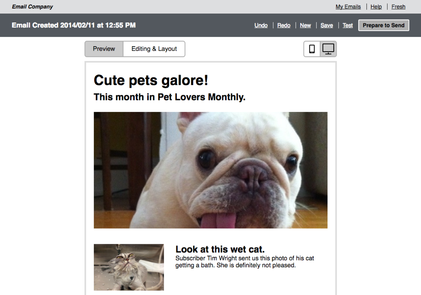
A screenshot from the editor interaction prototype.
A few years into my time at Fresh Tilled Soil we got the opportunity to work on a really important project: a complete UX overhaul for the new version of a Constant Contact's email editor product.
CC was rebuilding the entire email part of the platform, and wanted some extra UX muscle to help out. The project started as a simple redesign of the editor itself and gradually expanded in scope to include testing and messaging around driving existing users from the old editor to the new one.
My contributions were to sketch different interaction patterns, code prototypes to test with, and lead usabilty testing of the prototypes.
Challenge 1: Prototyping Interactions
InVision was a very new product at the time. We wanted to try it out, but realized that it wasn’t robust enough for the complexity we needed to do good testing. Because we were dealing with very complicated micro-interactions, I decided to build the prototype in code instead. This gave us the ability to tweak affordances and interaction events to monitor how it helped improve a user’s ability to understand how to use the editor.
Solution
I kept the fidelity of the UI very low, at the wireframe level. I only included color and animation when they were critical to enforcing the affordances of an element or the result of an interaction. We also divided functionality into groups: interactions that had to be fully available to test vs things we could learn about just by seeing whether or not a user clicked on them. This way, I didn’t have to build any functionality that wouldn’t improve the test results.
Result
The new editor tested very well with members of our test audience. A nice feature of working with CC was that they already had a great testing process set up internally and so we were able to get quick access to their users whenever we made changes. And because we limited prototype functionality to just features that required more in-depth testing, it was really easy to make updates to the prototype on the fly as we tested. We were able to refine the final prototype into production-ready documentation in a few short weeks.
You can view the actual prototype we tested with here: Email Interaction Prototype.
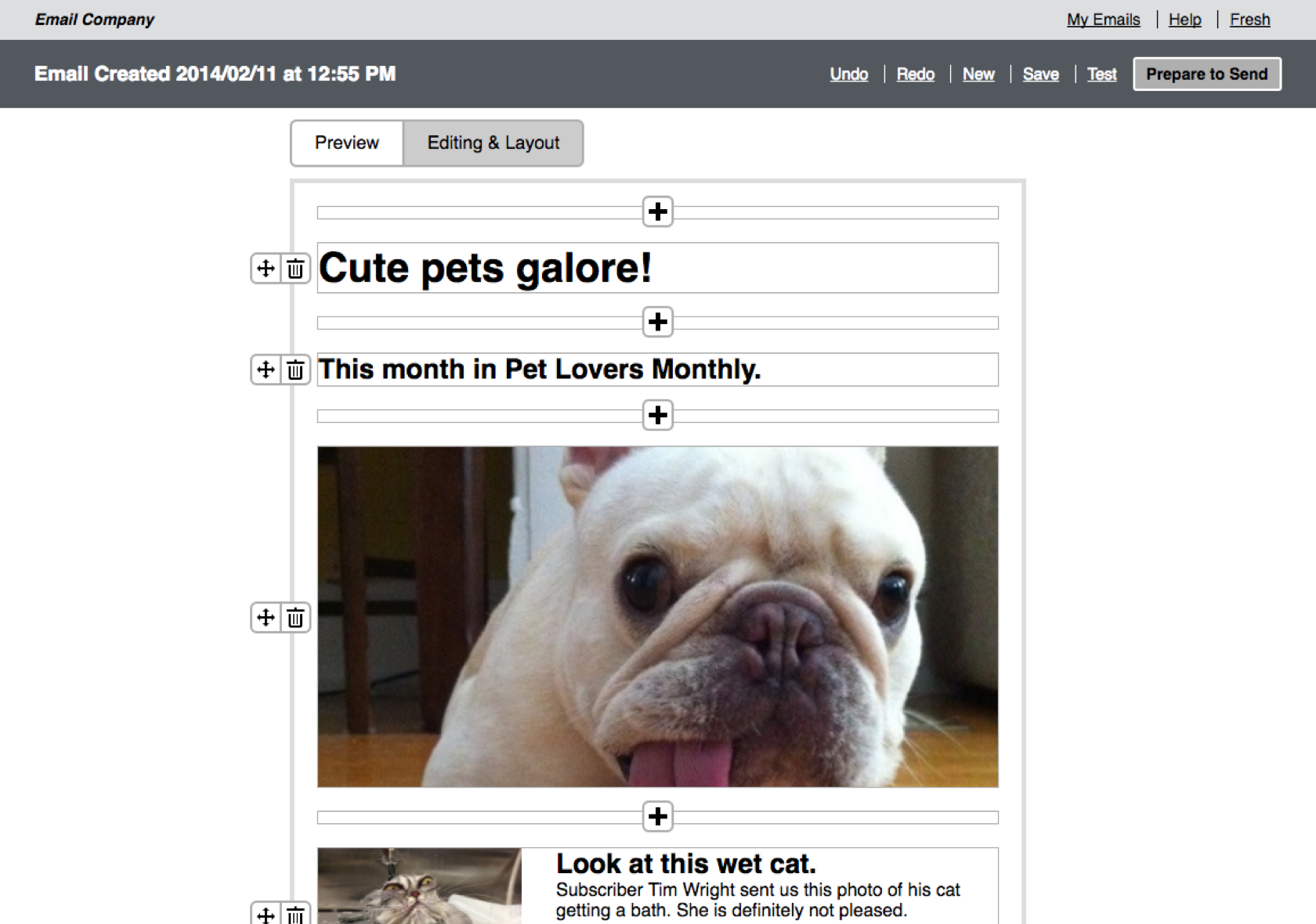
The editor interaction prototype in edit mode.
Challenge 2: Convincing Users
Due to the chaotic architecture of email templates from CC’s early days, we couldn’t just move all customers to the new editor. Future templates would be built on a similar architecture so they could be ported with ease, but for now we had to deal with convincing users that they actually wanted to use the new editor. However, a common user habit was to create new emails by copying an existing email rather than starting from scratch. This approach was incompatible with the new editor.
Solution
I ended up building another prototype that demonstrated how a user could drag blocks of content from existing emails into a new template. I did a manual conversion of our test users’ emails into a format that could eventually be done automatically to make sure they’d be testing with their own past content. Then I set up an interstitial that would ask them if they wanted to try copying content to the new format, and show them how to do it.
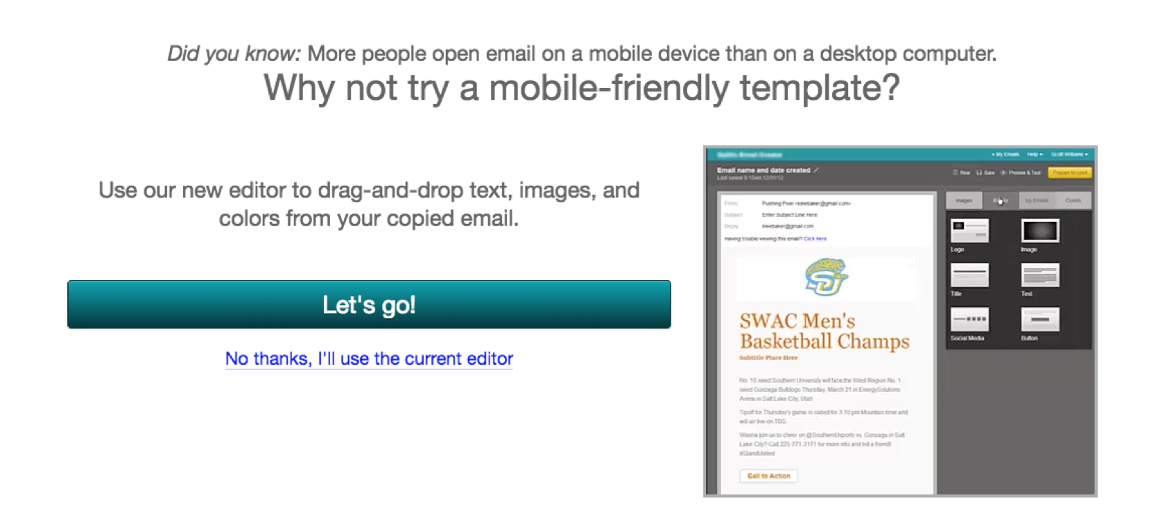
The interstitial that would bring users to the behavioral testing prototype.
Result
Users understood what we were asking them to do. About half jumped immediately to the new editor to try it, while the other half just wanted to work with what they were used to. We handed off our testing videos to the product marketing team to see if they could devise better ways to message the benefits of the new editor to improve these results.
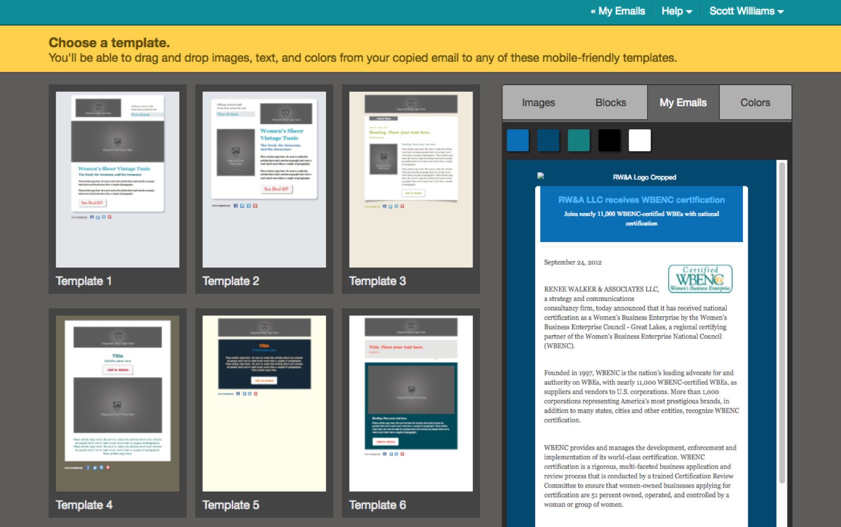
The behavioral testing prototype, in editor mode.
Users also had a pretty easy time copying old content into the new editor. It wasn’t an exact duplicate of the other editor prototype we’d made. Instead, it was customized to the purpose of helping a user understand how to move their content over. These learnings were incorporated into our recommendations for building out the actual new editor.
Final Thoughts
The two biggest lessons my team took away from this project were the importance of adjusting a prototype’s fidelity to the problem being tested, and not to underestimate the attachment users have to the way they’ve always done things.
Each prototype went through multiple internal iterations before we judged them sufficient to isolate the problems we were testing for. Our care and attention in these phases made it so that we got great test results, learned some surprising new things, and were able to adjust on the fly to improve our outcomes quickly.
The behavior prototype was trickier than the interaction prototype by far. Users exposed to just the interaction prototype thought it was great, but when confronted with the actual task of moving work many just wanted to go back to what they were familiar with. We had to a lot of testing to figure out how to persuade them that the time put into making changes would be worth it. We’d never have discovered this if we hadn’t identified our assumptions ahead of testing. In this case “users will want to use the new editor” ended up being the riskiest bet.