This was without a doubt the most complicated, confusing, difficult, and rewarding project I have ever worked on. The client has a product suite based on pharmaceutical analytics data. I worked on a small project for them soon after starting at Fresh Tilled Soil, and they came back a few years later to work with us again. Between these two projects the company had started to scale and found venture funding based on the “guided analytics” approach we had advocated for and created the first time we worked together.
The task was much more ambitious this time around. Their first customer for the upcoming product was a major pharma company. The problem they wanted solved was to reduce the time and effort that went into studying patient outcomes. Typically, a researcher would have to define disease parameters and then create and analyze a cohort of individuals to determine their treatment outcomes. This could takes weeks-to-months and most studies ended up getting discarded once the full results were ready.
What this company wanted a tool that would let their business analysts put together a “rough” study at around 80% confidence in the result, and they wanted to be able to do it quickly. This way researchers would only ever dedicate time to do a full study on cohorts and conditions that had already received some validation of opportunity. Successfully building this product could represent billions of dollars in savings for them every year.
The project team we put together was:
- Myself, as Project Lead and UX Designer/Strategist
- Tim Lupo, as Project Manager
- Jonathan Barker, as UX/UI Designer
- Kristy Banfield, UX/UI Designer
- Scott O’Hara, as Front-End Developer
Beyond coordinating all the UX/UI work my contributions were working with the researchers on the client team to outline how assembling a clinical study actually worked, refining their ideas, resolving their conflicts, creating the basic nav/interaction model for the entire application, and testing/iterating on complex interactions within each functional section of the app.
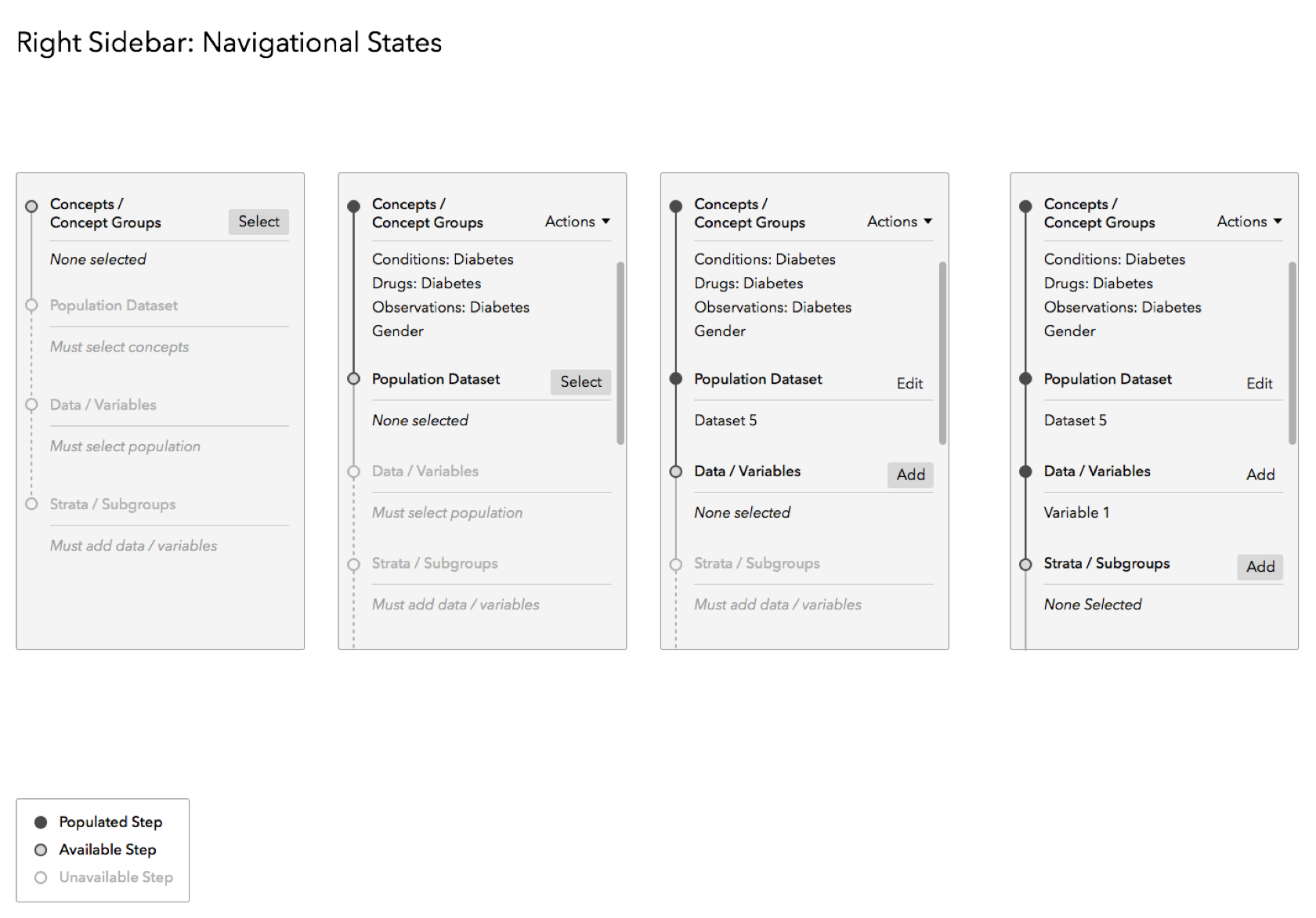
Challenge 1: Defining the User Journey
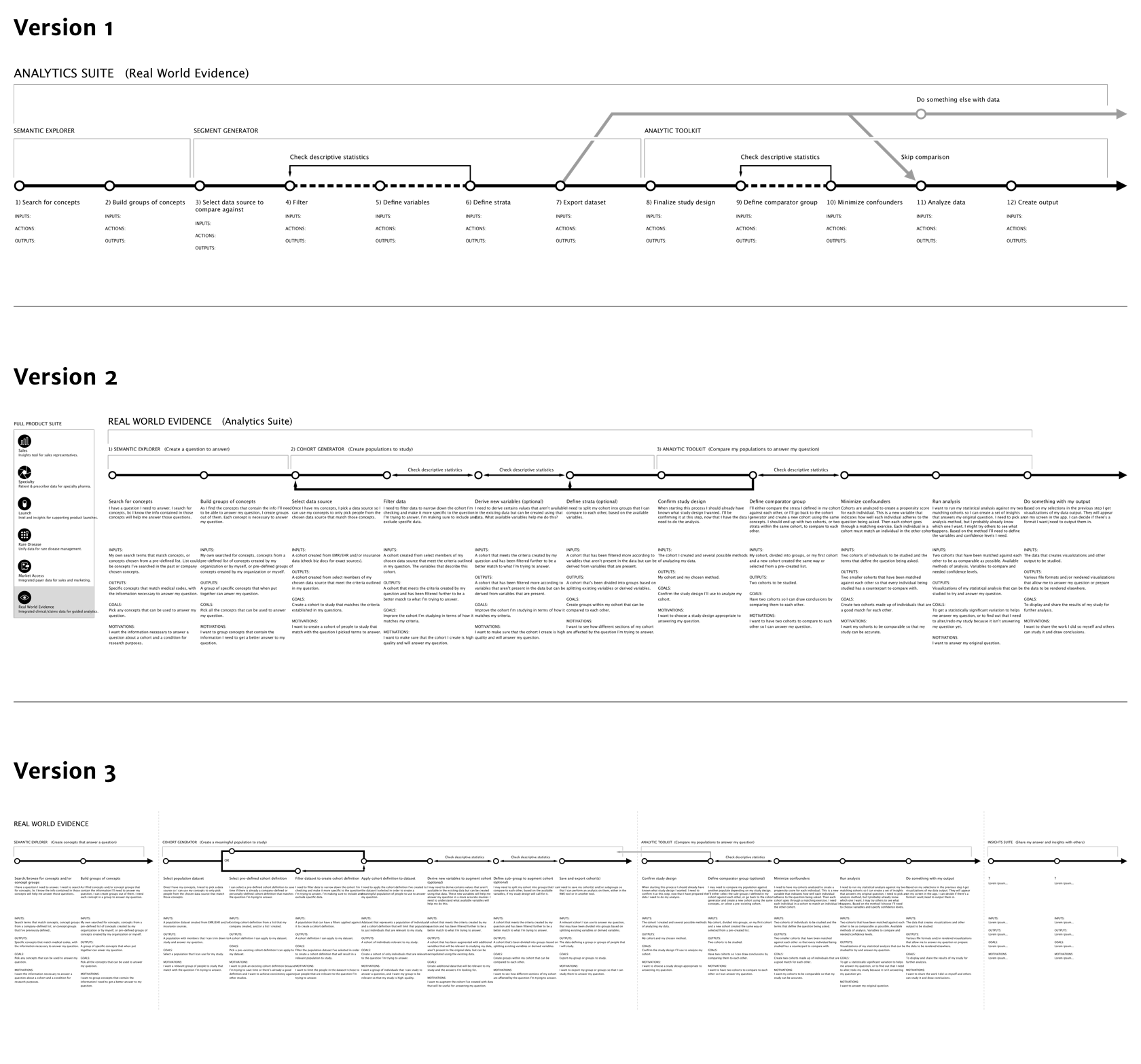
The three versions of user journey we went through on the path towards a common understanding. As you can see, they get increasingly complex over time. You can view PDFs of Version 1, Version 2, and Version 3.
To turn a manual process driven by a couple of high-level programming languages into an effetive UI required us to understand every step of the current process, why things were done the way they were, and whether or not changes and simplifications were possible and/or effective.
It turned out that all the researchers thought they agreed on the approach. In practice, they all had different ideas and hadn’t figured out how to express them clearly. My task for this phase of work was to assimilate all of their knowlege and then push them into agreeing with each other on an approach.
Solution
Our final journey map ended up being far more complex than they had even anticipated. A common refrain towards the beginning of this phase was “and then that next part is pretty easy”. This was basically never true. However, we eventually arrived at a conceptual model for the application that made sense to everyone in the room.
Result
We were able to establish a journey map that guided all of our following efforts and could be referred back to as disagreements over approach sprang up again. This was frequent, but in no way a sign of dysfunction. The team had simply never had an outsider to coordinate their understanding before.
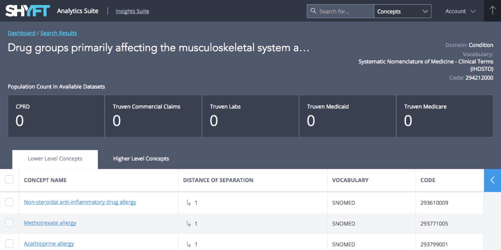
Challenge 2: Defining Diseases
To make a study users had to define the disease or condition being studied before defining the population to be studied. This was probably the “easiest” part of the project, but was complicated in its own way.
In life sciences, conditions are defined using any 1 of many different “vocabularies” and the codes within them. A specific vocabulary is a manner of defining the relationships conditions share with each other, and the codes represent very specific manifestations of those conditions. These codes are used in patient records to track their conditions.
We had to define a method of navigating these vocabularies, building collections of conditions to fully define what was being studied, and translating these collections across different vocabularies.
Solution
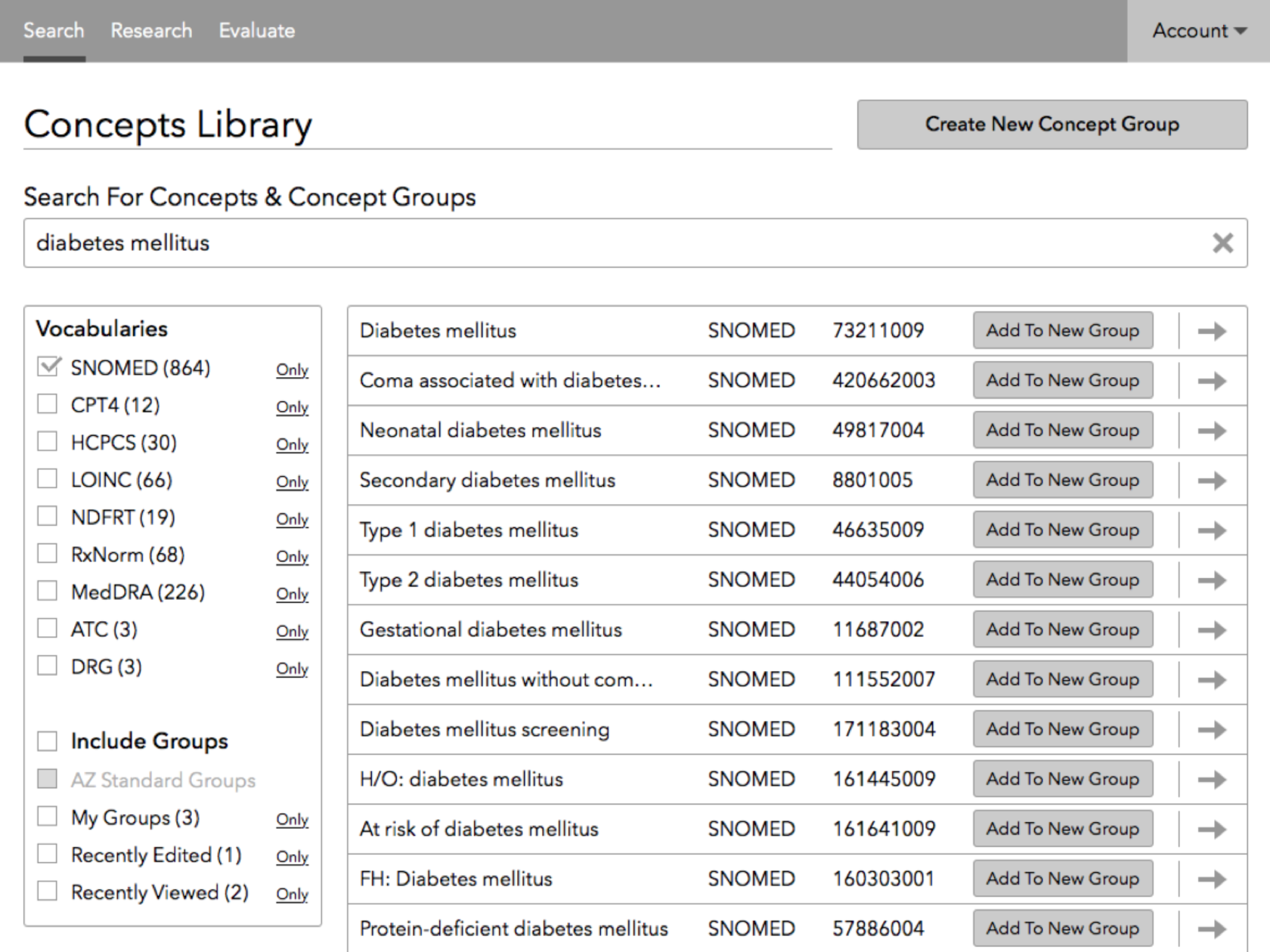
This is a screen from the final prototype of our concept navigator.
The basic navigational principles were relatively easy to define. Building methods of compiling and translating them were trickier, but achievable. The real accomplishment was constructing a navigational system that could be applied across different vocabularies and still give users a consistent experience, as well as effectively switching vocabs during a session.
Result
It became much easier to visualize the relationships that different conditions and categories of conditions had with each other. Unlike existing tools, we were also able to build a system for saving and sharing groups of related condition concepts to prevent users from redoing work that another researcher or analyst had already done, saving a great deal of time and resources.
You can view a prototype of the final version here.
Challenge 3: Defining Cohorts
The final major challenge, and the thorniest of them all, was inventing a UI for creating cohorts of people to study and compare against other cohorts. Usually, this is done by the researchers themselves in a couple of different specialized programming languages. We had to come up with a way for someone with much less research-based experience to do almost as well, without knowing any programming languages or principles.
Solution
We went through many rounds of sketching, prototyping, testing an iteration before we finally reached an acceptable, usable first version of the UI for each component of assembling a cohort for study. The underlying principle was like a visual programming game we came across, but made much more complicated. While it would still require some knowledge of how a cohort is assembled in general, it was capable of doing all the core functions of the various programming languages researchers were using to do this instead. It even guided the user through an order of operations designed to prevent making silly mistakes that could result in cohorts of zero patients.
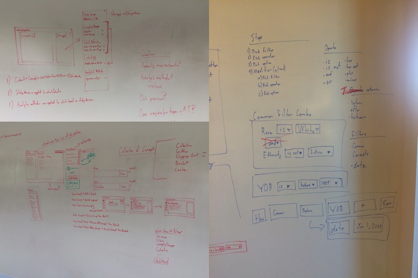
Our whiteboard after multiple collaborative sessions trying to design a basic navigational concept.
All of the early concepts were based on breaking tasks down into logical groupings that could be focused on 1-at-a-time. Specific guidance in the manner of Turbo Tax was implemented at every stage.
This is an early visualization of the guidance component of the app.
Result
The client judged the final navigational prototypes to be capable of their original product vision of having an interface that would allow visual assembly of a cohort without involving a researcher/programmer. We usability test the model successfully with future users, and were able to use the post-launch roadmap to anticipate upcoming functionality and build early component patterns to adapt to the eventual updated functionality.
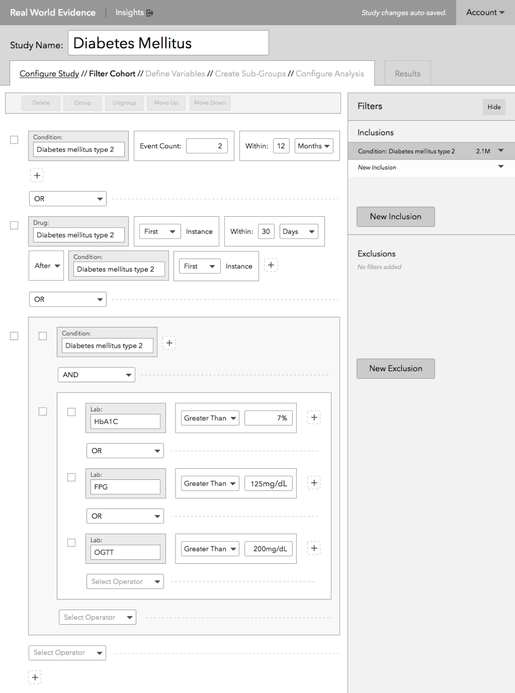
A late version of the cohort filtration functionality before being adapted into a prototype for testing.
The following prototypes were all built and tested on the path to developer implementation, with front-end design, build, and interaction created simultaneously.
- Final "V1" Prototype
- Updates to Multi-Variable Subgrouping
- Updates to Creating Derived Variables
- Updates to Creating Line of Therapy Variables
- Updates to Calculating Propensity Score
Final Thoughts
The complexity of the subject matter and large number of involved, knowledgeable parties made this project a unique challenge. Ultimately, we succeeded as a team by adhering to solid design principles and methods. Research, testing, and constant iteration allowed us to build something truly useful with a massive ROI for the client and their client companies.