The original text of this article can be found at:
http://www.freshtilledsoil.com/for-a-few-yahoos-more-the-yahoo-redesign-reconstructed/
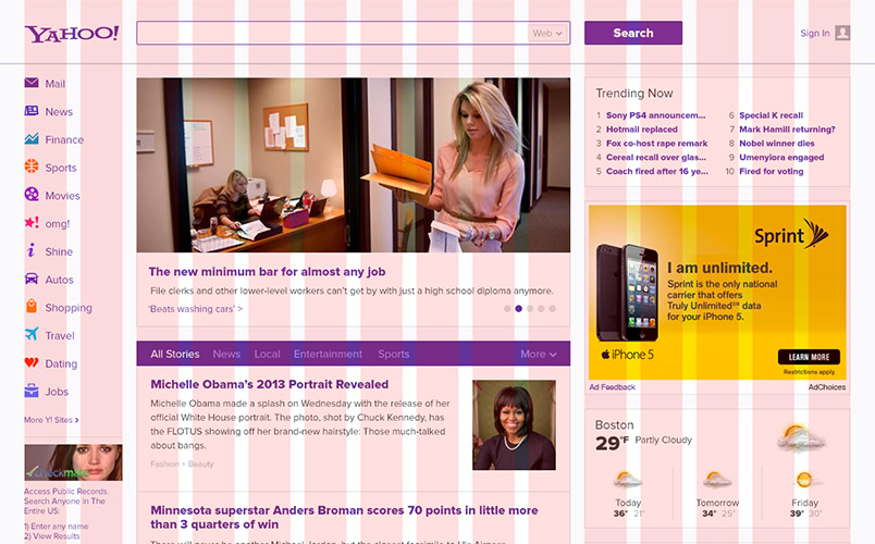
Why Reconstruct It?
If you read our first post then you know we had a lot of issues with their redesign effort. While our team felt unanimously that it was an improvement, it was really only an incremental one. I’d argue it was really more of a restyling than anything else, as the content and structure are largely similar to what existed previously. We decided to try to create a cleaner, more visually pleasing presentation.
Grid & Spacing
The Yahoo! team’s version seems far too cramped to us. They designed it to be flexible between 980px and 1200px but it doesn’t seem to account for any increase in vertical space available on today’s monitors. And while there are 3 main columns clearly present, it’s difficult to detect any strong, underlying grid structure.
Our solution was to increase the line-height of all the typography, increase the type size in a few key places, and to add a great deal of vertical space above and below many elements of the design. We also created an 11 column grid and aligned the main elements of the redesign to this grid. The effect is a much cleaner and easier to read layout, with a strong sense of underlying order that isn’t present in the Yahoo! team’s version.
Typography
We found a lot of inconsistency in the type sizes used in Yahoo!’s version, so a major part of our reconstruction was to consolidate sizes that were very close to each other. We also pushed the contrast of bold headings against their normally weighted body copy, narrowed down the color palette to the brand purple and one main shade of grey, and added some extra space around typographic elements.
Finally, we gave the entire page a new main typeface, Proxima Nova. Proxima Nova is an excellent sans-serif typeface with a bit of a humanist feel that makes it more inviting and easier to read than Helvetica or Arial, the default typefaces in which Yahoo!’s page will render depending on the platform you’re using to view it. We found that just this small change drastically improved the experience of reading content on the page. However, it should be noted that the Yahoo! team wouldn’t be able to easily implement this due to technical considerations. With the kind of traffic they receive, loading extra resources could be a huge performance hit for users and a bandwidth cost for them, and the pricing structure on many web font platforms could potentially make this step completely impractical for them.
Ads
The ads in Yahoo!’s layout don’t match the width of the other elements in their columns, and that turns out to be very visually jarring. There are two solutions to this: 1) use responsive techniques to alter the standard ad sizes to fit the other content, or 2) alter the other content to match the width of the ads. As this is intended to be a flexible layout, we felt it was better to make the ads flexible and not alter the content of the sidebar.
Consistency
The grid and typeface changes we implemented were mainly for the purpose of solving all of the major inconsistencies in Yahoo!’s version. Gutters had varying widths, vertical space was limited and inconsistent, we couldn’t detect a sensible underlying structure, and the type sizes and colors were all over the places. We dramatically simplified the number of variations we used to make the layout more visually appealing.
Elements We Removed
We also ended up removing some elements, within what we felt the Yahoo! team’s constraints would have been. First, we removed the Mail link from the upper right hand corner for users that aren’t logged in. It serves no informative purpose if a user is logged out or doesn’t have an account, and Mail is already the first link in the left sidebar navigation.
Second, we drastically simplified the carousel of lead stories. Carousels are frequently a poor attempt at problem solving, when a team can’t come up with a decision on what’s most important. In this case, the carousel stories didn’t seem to be substantially more important than the stories presented in the infinitely-scrolling column below them, and their presence was distracting from the currently highlighted lead story. Rather than removing them completely we simplified down to a rotation indicated by a set of active and inactive dots that can be clicked to change the story and indicate your progression through them. This made the whole section cleaner and created a stronger focus on the currently visible lead story.
Wrapping Up
We want to stress that we aren’t bashing the job Yahoo! did with their restyle. It’s massively difficult to change a property with that much traffic and with so many stakeholders, and to do so with out alienating a giant installed user base is even more difficult. And our team certainly felt it was an improvement over the old version. However, we felt it was important to demonstrate that with some extra time and additional attention to detail it would be possible to increase the pleasure of scanning and reading their page, without sacrificing the needs of their company.
You can see the full-sized version of our restyle here.